
ACO. The global market leader in drainage systems and our long-term partner. They don't need us to build credibility—they need senior creative support without agency overhead.
ValkaAI. Unfolding the brand.

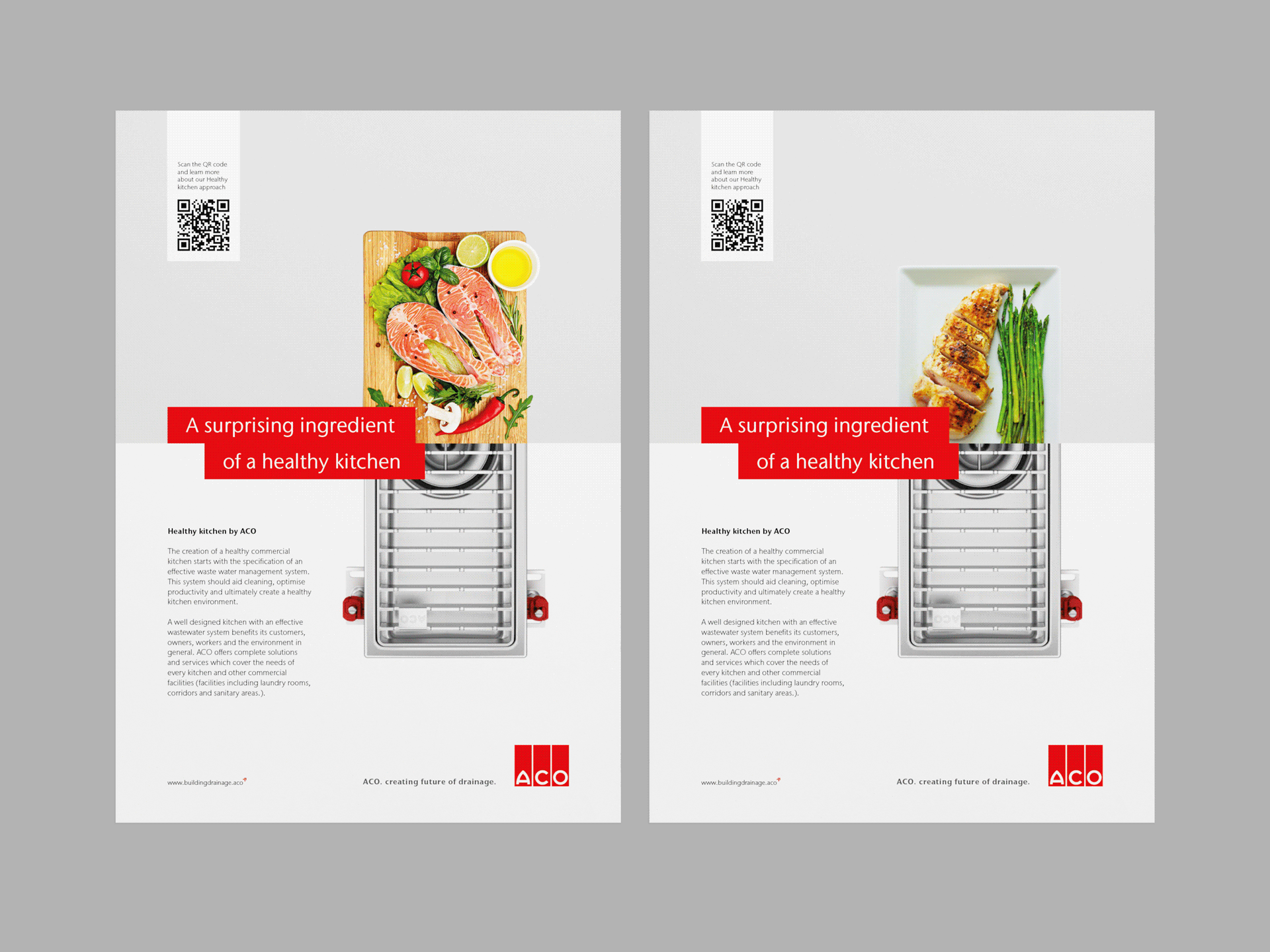
- Healthy Kitchen | Intro
ACO Healthy Kitchen — global strategy and creative concept for the commercial kitchen segment. We start from the premise that nutritionally healthy food is not enough. A healthy kitchen should be concerned with sustainability, the health of the entire supply chain — from ingredients to operations to waste management.
- Healthy Kitchen | Leading idea
The creative concept and art direction of the campaign aim to surprise. The communication campaign is based on a short image spot that combines the theme of healthy cuisine with ACO products.

- Shape the flow | Objective
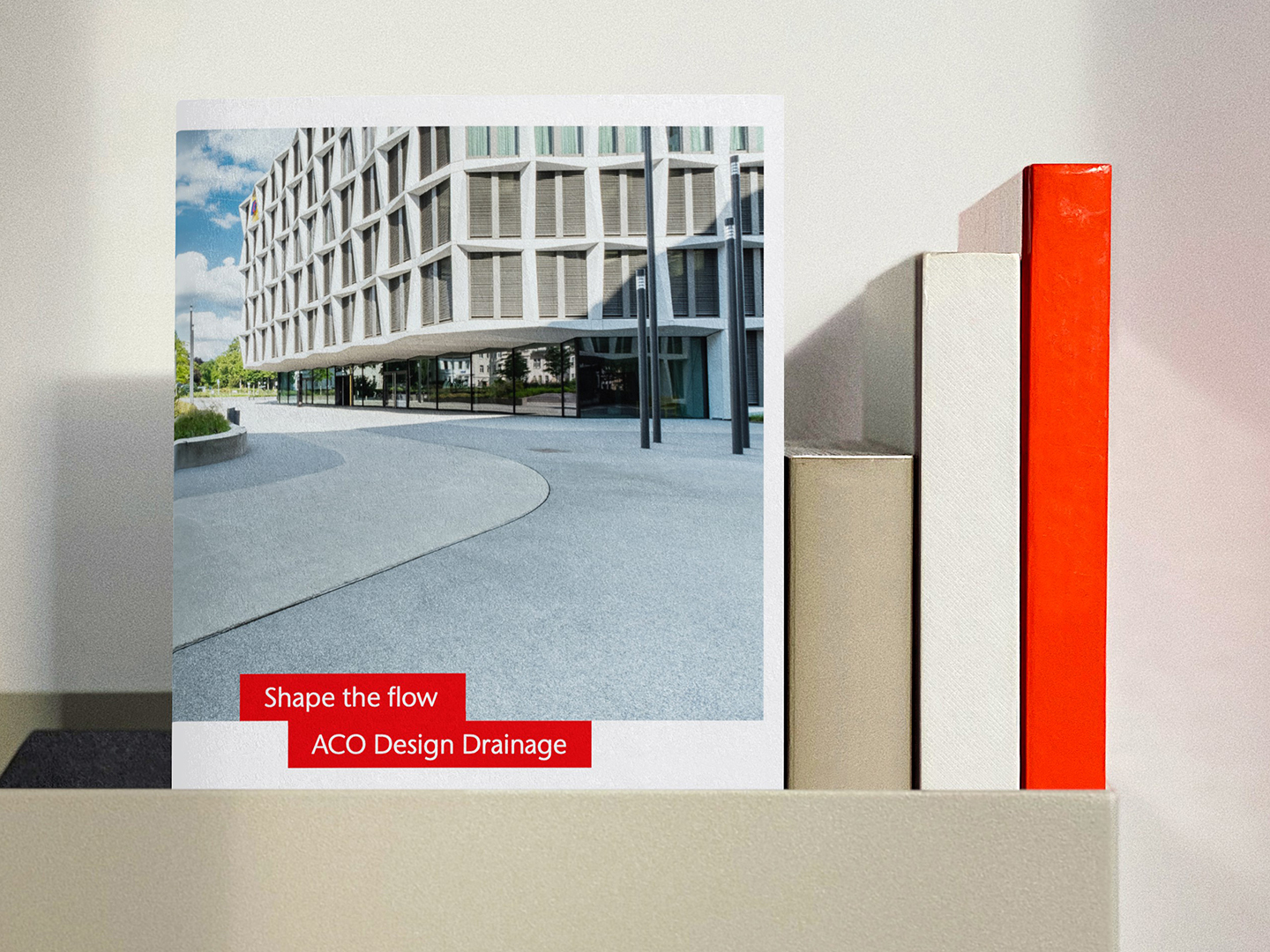
Establish ACO as the default drainage specification for architects. The category treats drainage as invisible infrastructure—builders choose based on price and availability, architects specify whatever builders recommend. ACO needed to shift this buying behavior by repositioning drainage from construction detail to design decision.
- Shape the flow | Strategy
Reposition drainage as design infrastructure that shapes architectural outcomes. Water flow impacts spatial design, material choices, surface treatments, and building aesthetics. Architects who control drainage specification control complete design execution. Position ACO as the solution that gives architects this control—technical flexibility, sourcing convenience, specification expertise.
- Shape the flow | Idea
"Shape the flow" connects literal function (water management) with design benefit (control over architectural outcomes). Campaign demonstrates how drainage choices shape visible architecture—not hidden utility, but integrated design element. Visual system uses signature red line overlaid on high-quality architectural photography to draw attention to where ACO products influence the final design. Architecture becomes the hero, ACO products become visible contributors to aesthetic outcomes.
- Shape the flow | Execution
Brand strategy repositioning drainage for architectural market. Visual system built on AI-generated architectural imagery (solving IP rights issues with real projects) combined with fluid motion graphics and product animation. Red line device makes invisible infrastructure visible in context. Campaign assets span social media storytelling, reference portfolios showcasing ACO applications, event presence at architecture community gatherings, and specification support materials formatted for design process rather than builder procurement.
- Product Stories | Intro
Short, punchy product stories that highlight key benefits and competitive advantages in an engaging way. Playful references draw attention to the main features, with deeper insights available on the website.
- Product Stories | Leading idea
Product animations start with a short, surprising story in simple 2D animation, seamlessly transitioning into a product visualization that maintains the set theme.

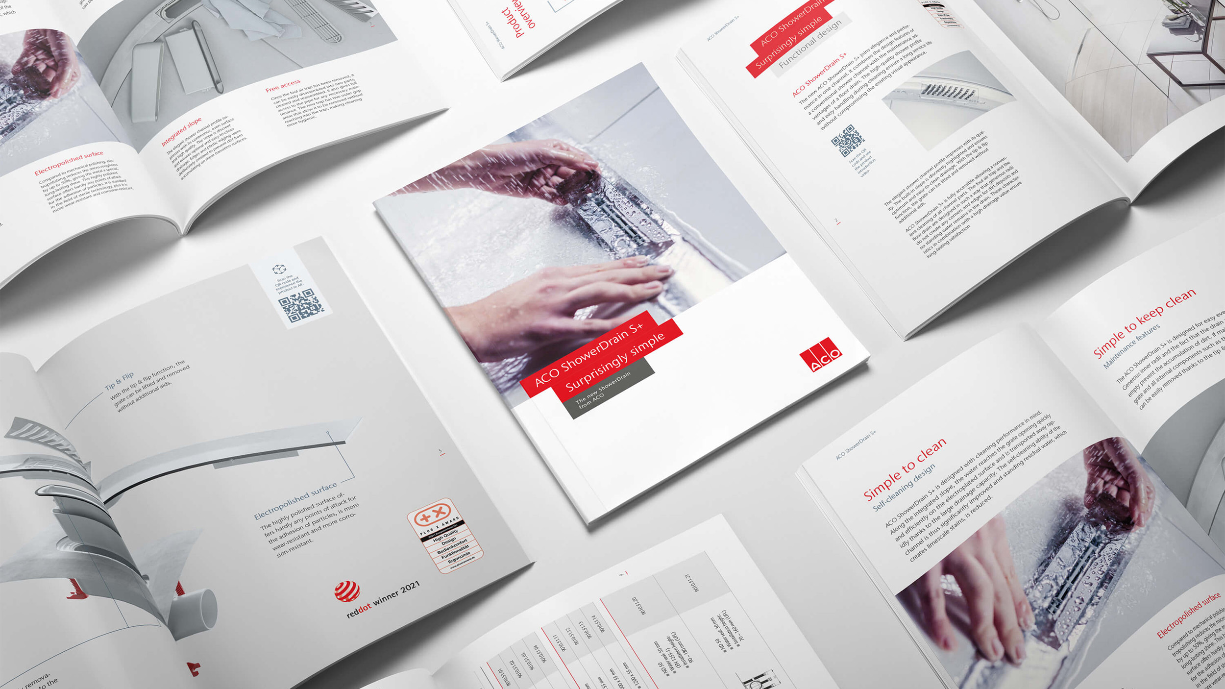
- Shower Drain S+ | INTRO
The category faces intense pressure on price and quality, along with a chronic lack of time for installation. At first glance, ACO’s product looks similar to its competitors, but a closer look reveals smart details that make installation faster and easier for plumbers and customers alike.
- Shower Drain S+ | Challenge
The challenge was clear—the product solves real problems, but it needs time and attention to showcase its advantages. Our creative concept brings installation benefits and user-friendliness together under a single punchy message: “The Surprisingly Simple ShowerDrain S+.”

- Shower Drain S+ | Design
Designed to spark curiosity and grab attention, this concept unfolds through two stories—one focusing on user benefits, the other on the ease of installation.
- HR Campaign | intro
In the Vysocina region, people seek two things in an employer—stability and meaningful work. These may seem obvious, but in today's uncertain times, they are anything but.

- HR Campaign | Insight
Stability is built on facts. Three decades of steady growth, wage progression, campus expansion, and continuous workplace improvements speak for themselves.

- HR Campaign | Design
Visually, the campaign stays true to ACO’s corporate identity, ensuring seamless alignment with the company’s global communication.


ACO is a global market leader in drainage systems and our long-term partner. They don't need us to build credibility—they need senior creative support without agency overhead.

ACO is a global market leader in drainage systems and our long-term partner. They don't need us to build credibility—they need senior creative support without agency overhead. We work on demand: strategic campaigns when market conditions require them, tactical executions when deadlines are tight, zero hours when their internal team has capacity. No retainer minimums, no account management layers, no work created to justify fees. Direct access to senior strategist and designer, immediate execution, costs aligned with actual business value. The relationship spans global product launches, regional HR campaigns, and segment-specific positioning—whatever the business needs, when it needs it.