

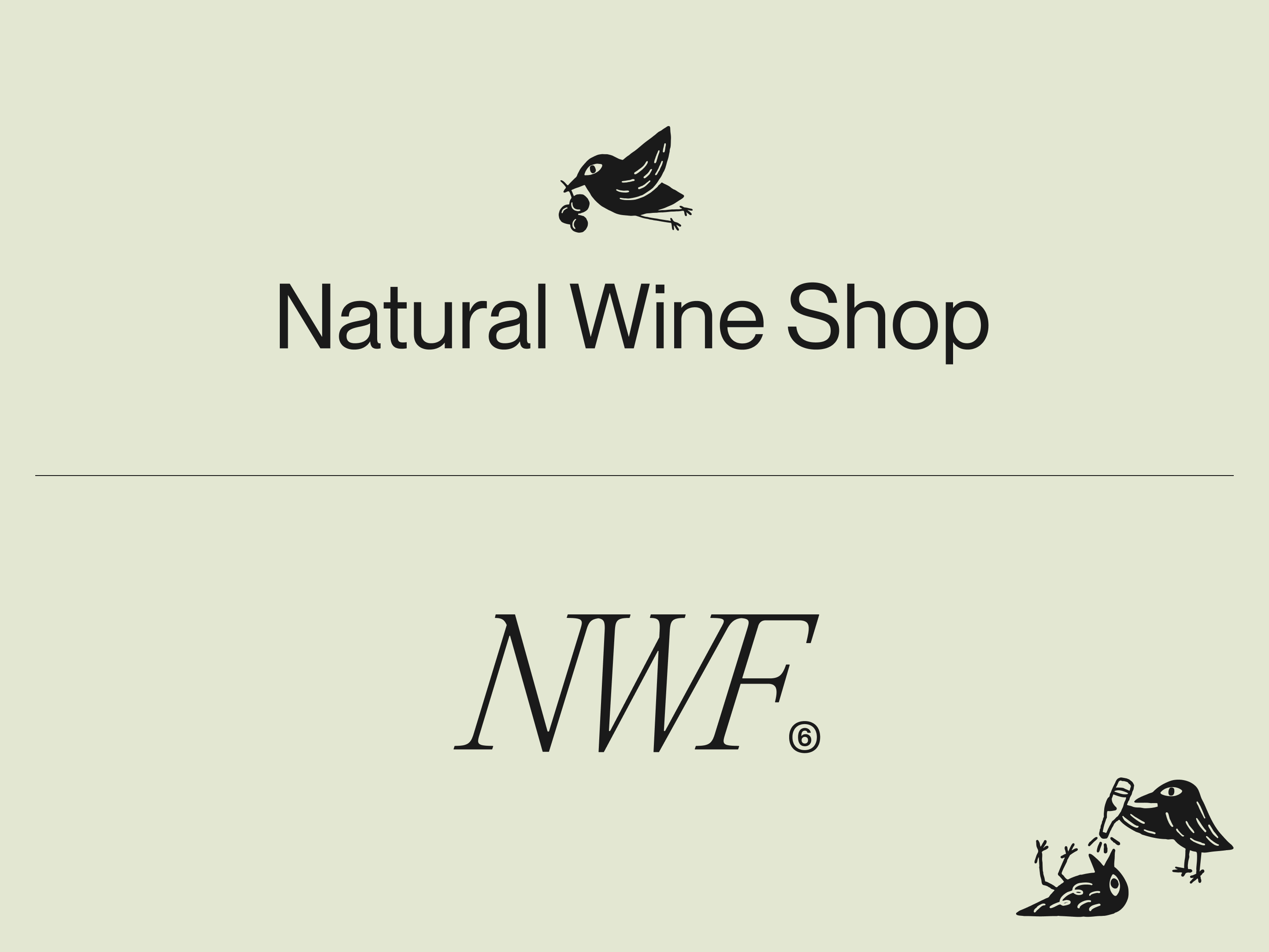
Natural Wine Shop is the legendary local wine shop specialising in natural wines. Natural Wine Fest is the well-established event, one of the biggest natural wine festivals in Europe. Both are owned by the same people, who work hard and genuinely care about natural wine quality and culture. Our task was to bring that to the world.
ValkaAI. Unfolding the brand.
- Challenge
Natural wine sells itself on authenticity, but the category is wild: inconsistent quality, unclear sourcing, producers nobody outside a small circle has heard of. People don't have time to research every single wine producer — they want a good natural wine, and that's when we step in. Our challenge is to give people a space to discover natural wine with the confidence that whatever they choose will, in fact, be good.
- Strategy
Make sure that both Natural Wine Shop and Natural Wine Fest are well connected and support each other. The goodwill of one brand flows to the other, and the impact multiplies. Both brands care about wine, culture, and their communities. Brands that lead with compassion and a plain desire to make people’s experience with natural wine easier and more fun.
- idea
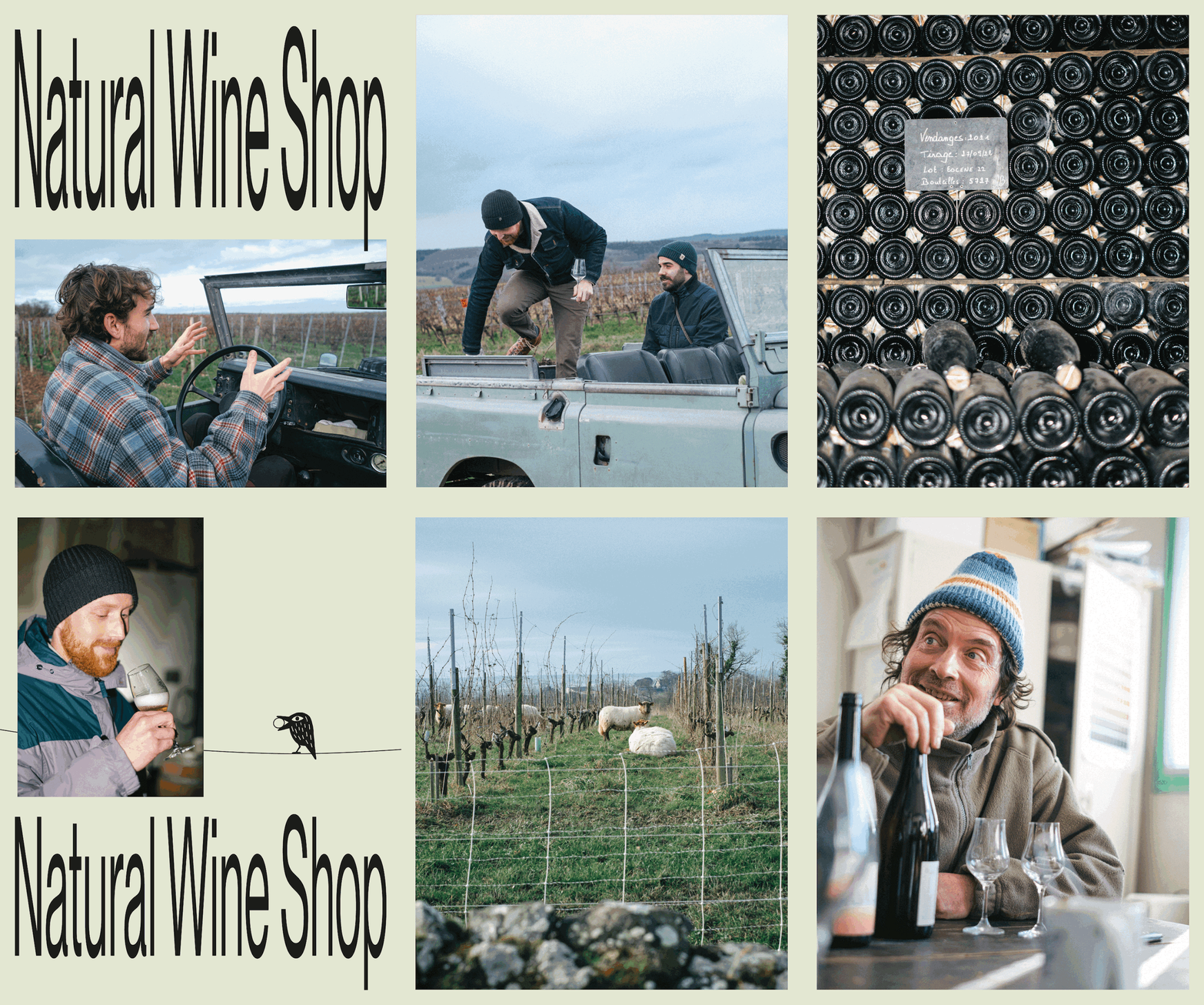
The brands behave like a starling. The bird every grower knows. Not because it eats indiscriminately, but because it goes for the ripest grapes first. It has taste, and it acts on it before anyone else gets there. Both brands share a similar desire. The owners travel from vineyard to vineyard, country to country, talk to the growers, taste before they buy, and only then bring the good ones back.
- Symbol
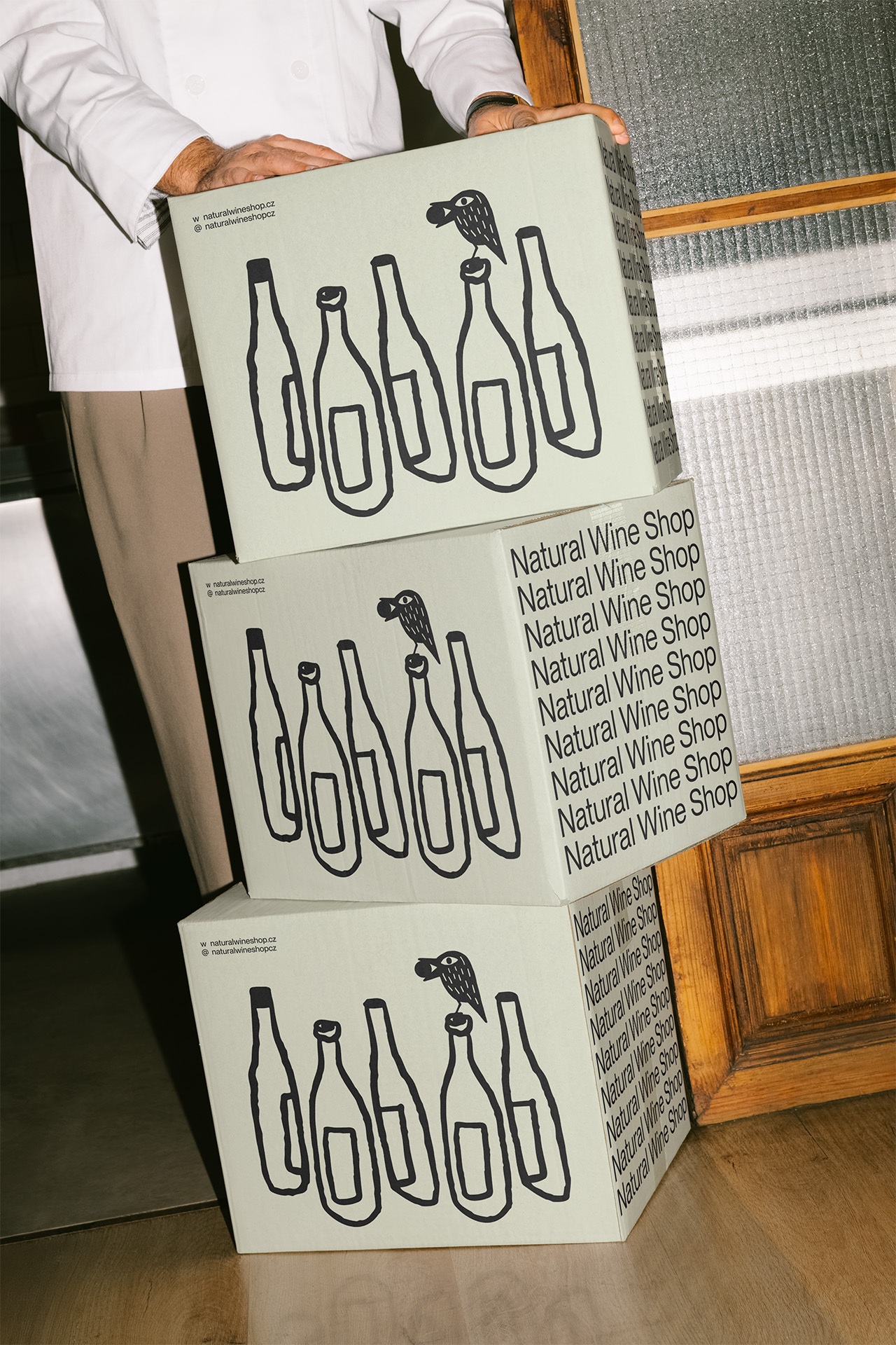
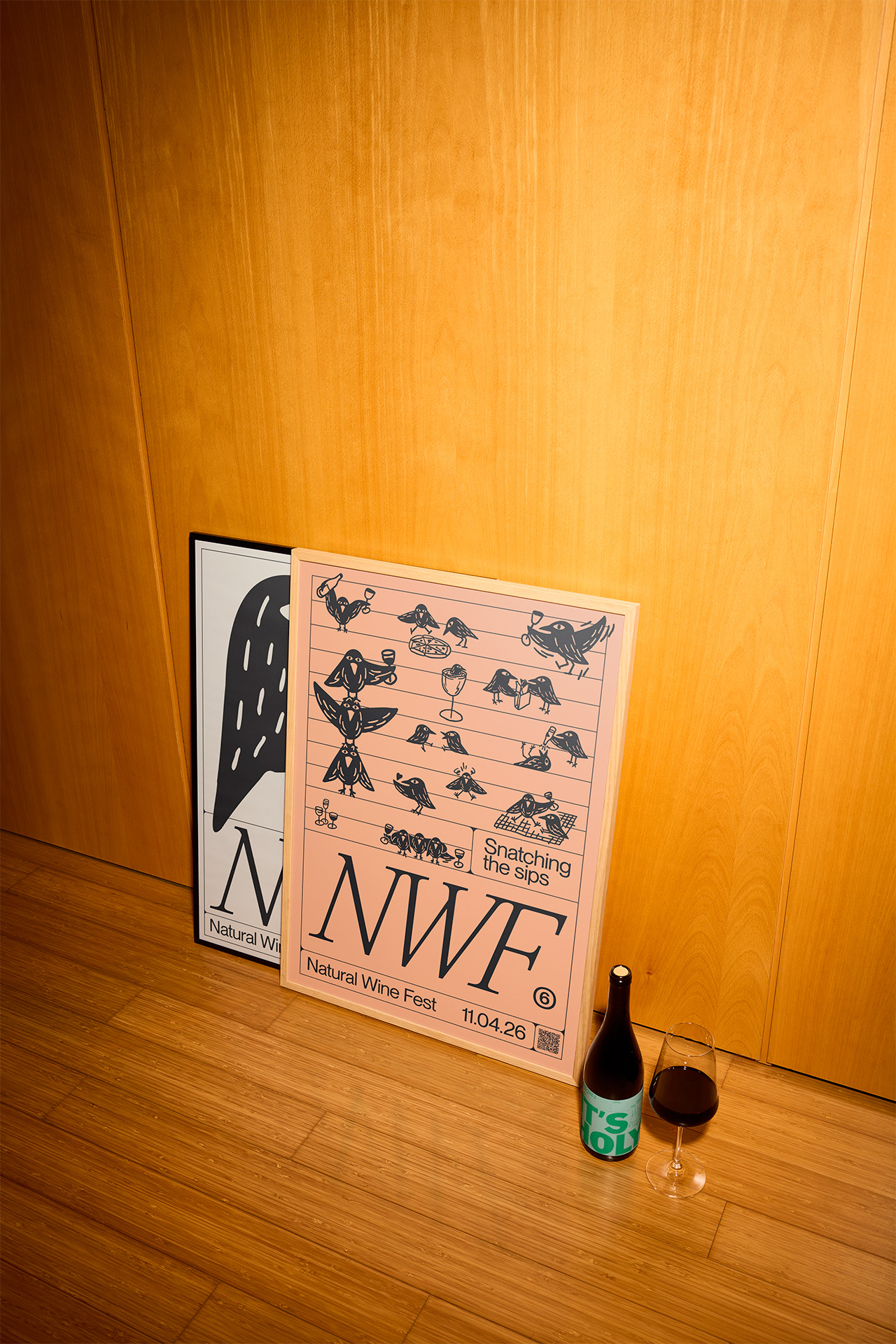
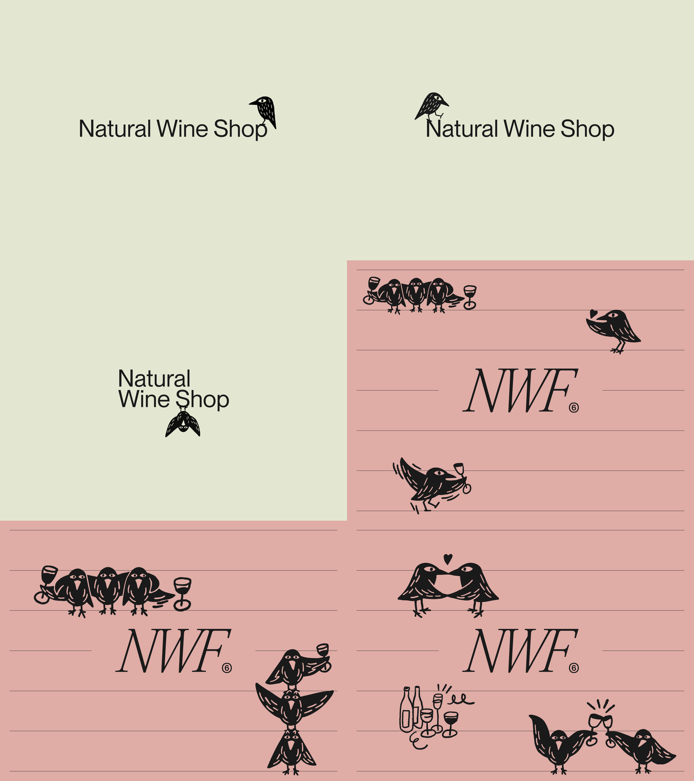
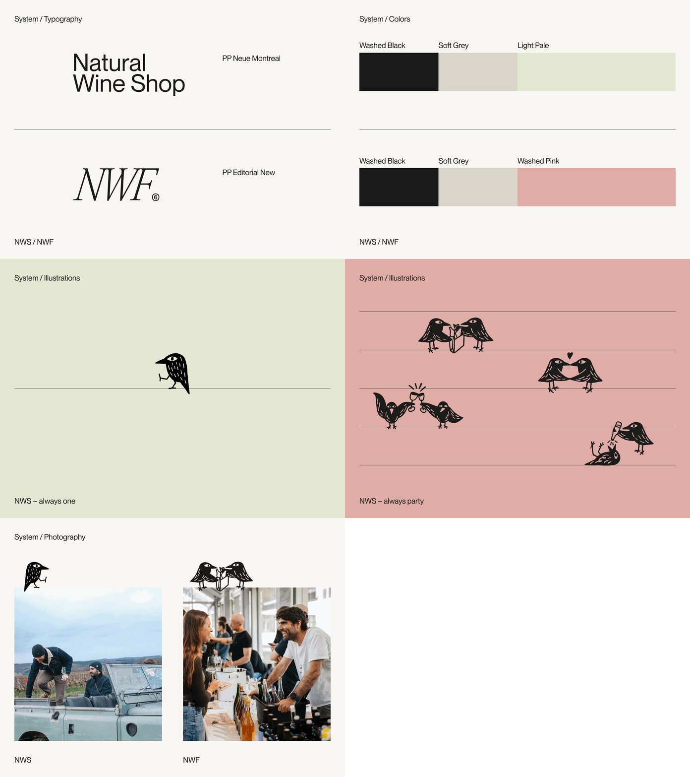
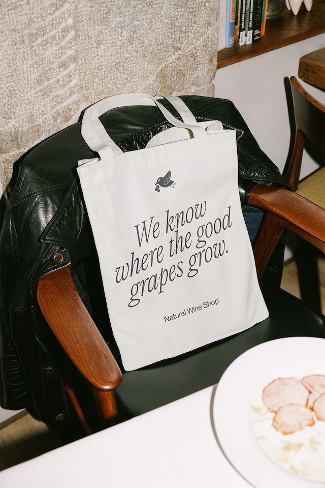
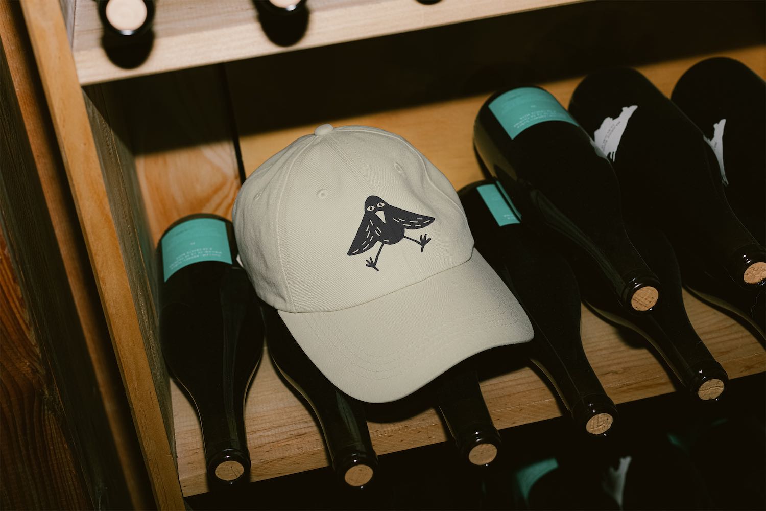
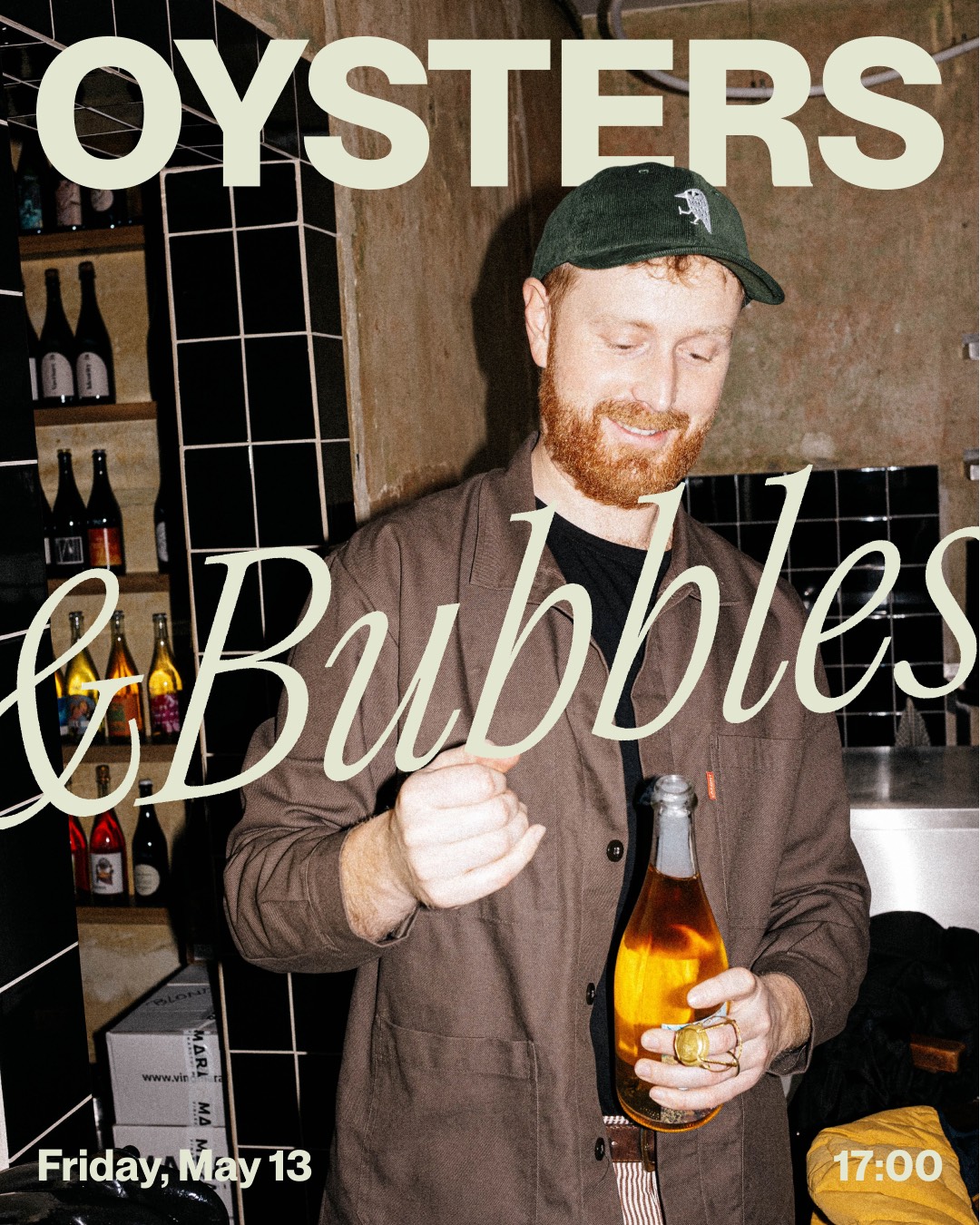
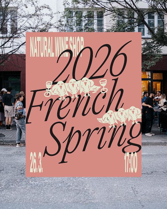
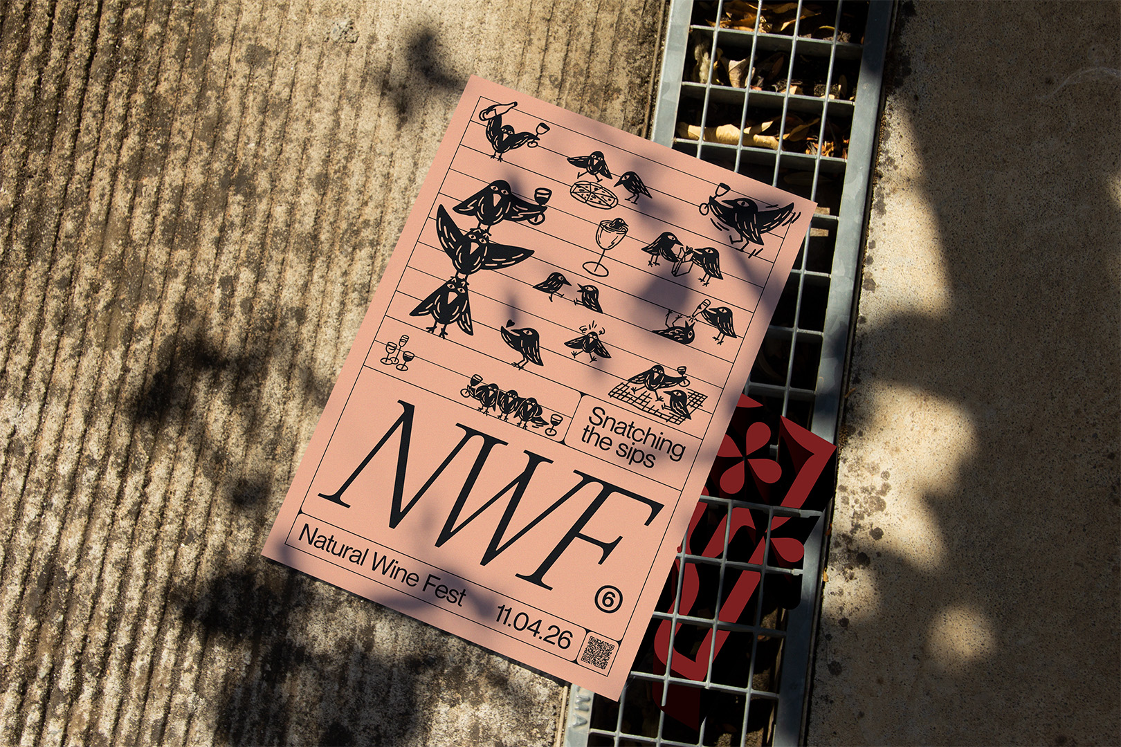
A stylised starling with a big human eye, ready to spot the great wines and bring them back. In the shop, the bird is a proper mark. Fixed pose, fixed style, repeated exactly across packaging, signage, and stamps. In Fest, the bird is an illustration. It multiplies, interacts, shifts pose and grouping from application to application, echoing the way people gather, cluster, and mingle at the event itself.
- Typography
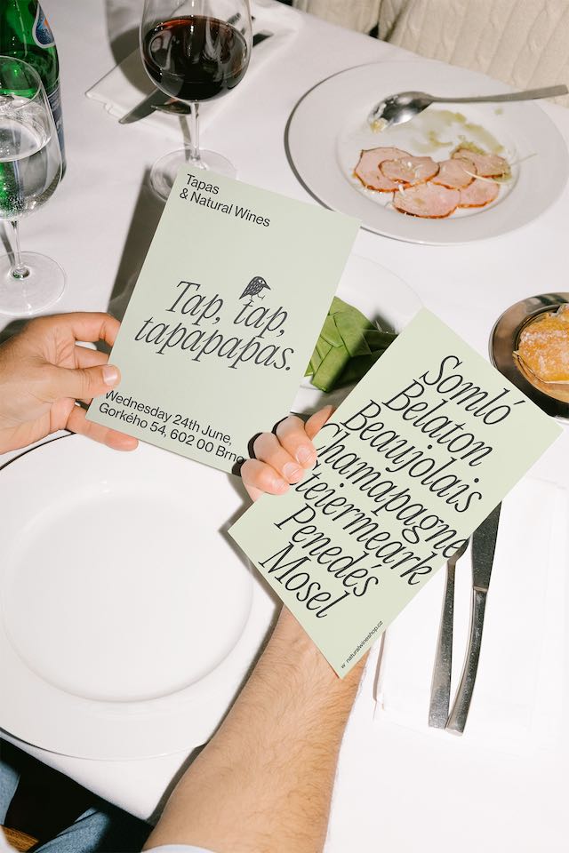
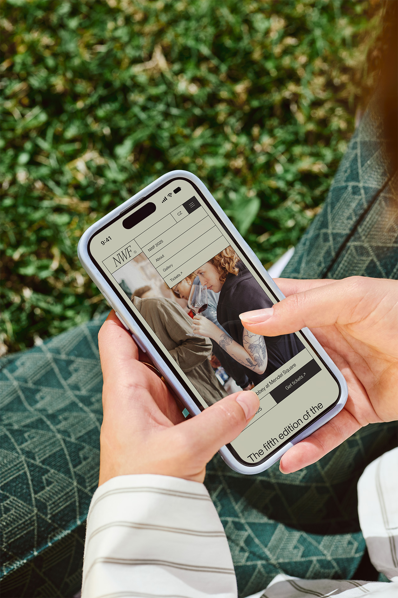
Shop is built on PP Neue Montreal, a contemporary grotesque sans-serif, as a stable counterweight to the wild world of natural wine brands and visuals. Fest uses PP Editorial New, a precise and elegant narrow serif that demands attention without shouting too hard. Both typefaces pair nicely: Editorial for headlines, Montreal for body copy.
- color
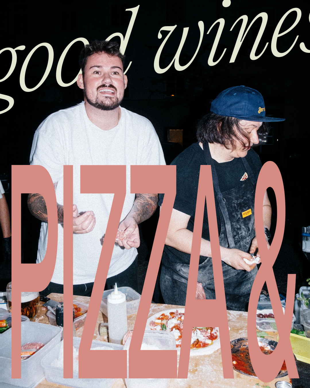
Color scheme is built around black ink and a light ground, the fixed primary pairing. A secondary, rotating palette of earth and wash tones (like peach, dusty rose, sage-grey, and tan) sits behind it as atmosphere, chosen per application with no fixed rule for which shade goes where. The hierarchy is fixed even where the palette isn't: ink carries the system, color sets the mood.
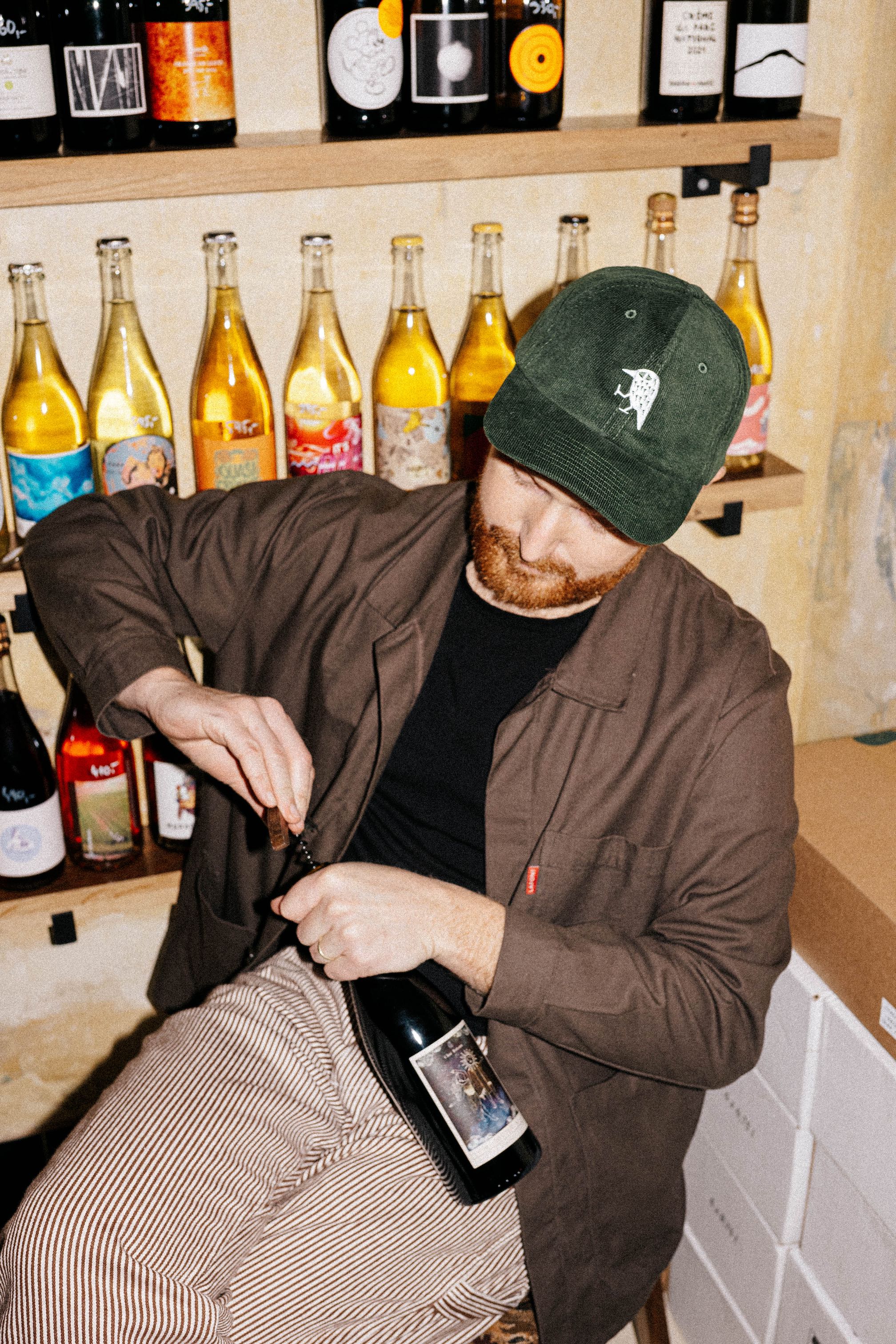
Natural Wine Shop ↓
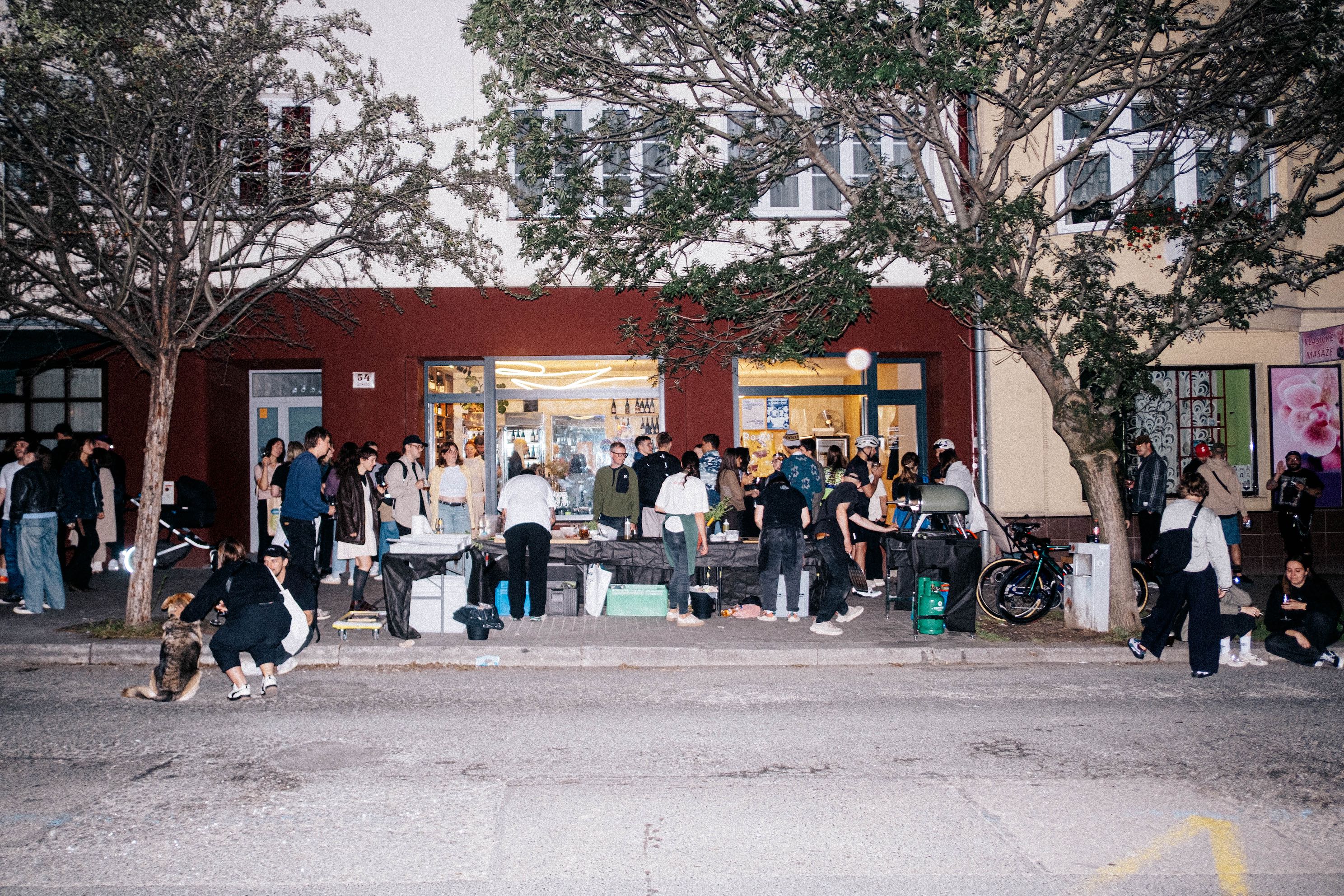
Natural Wine Fest ↓
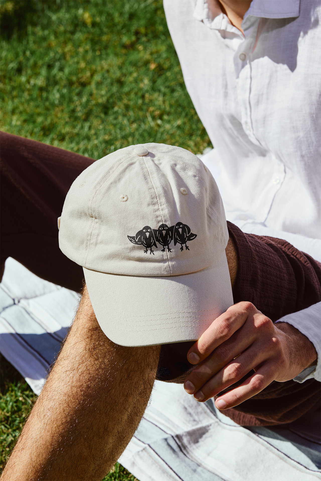
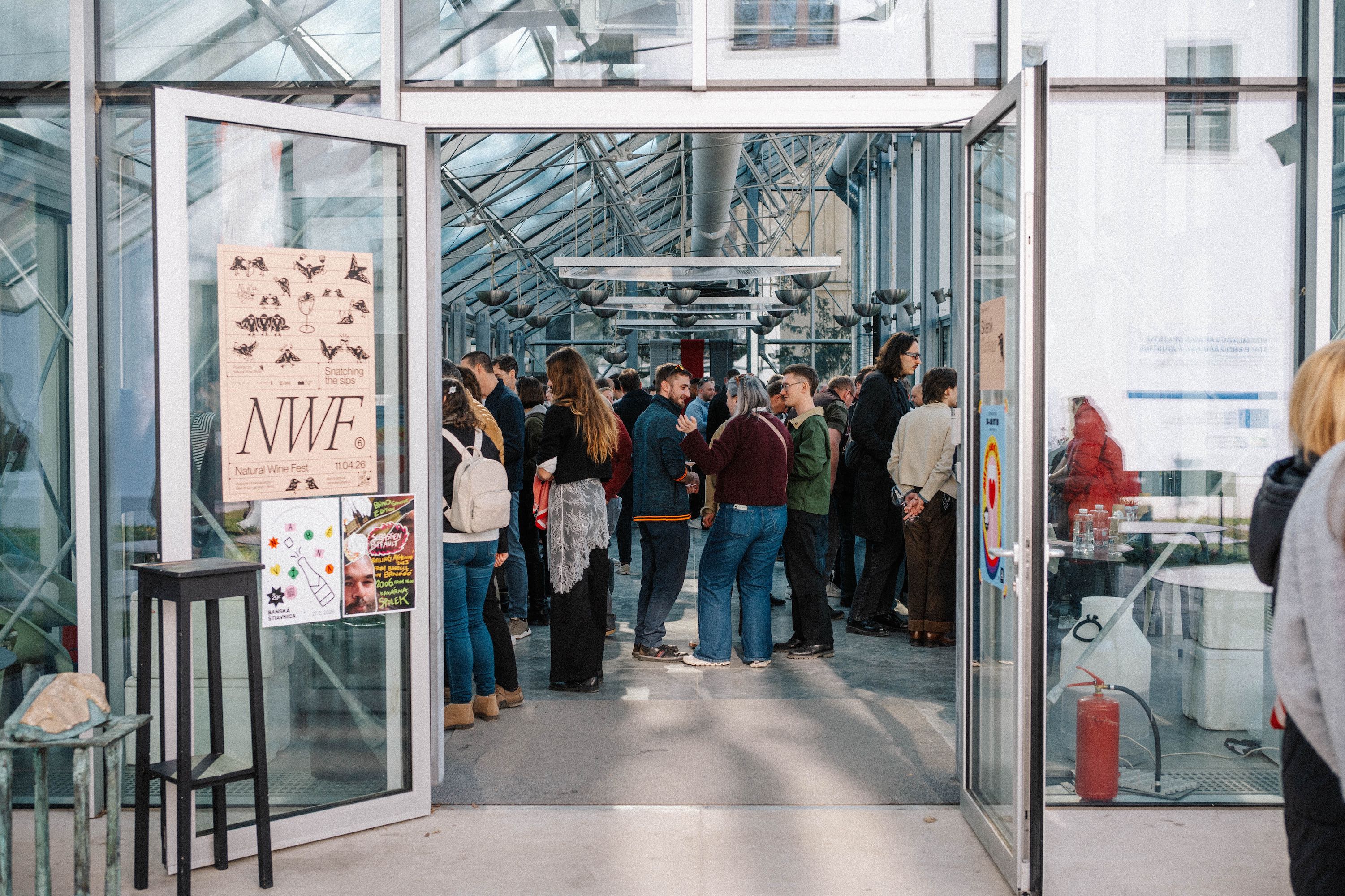
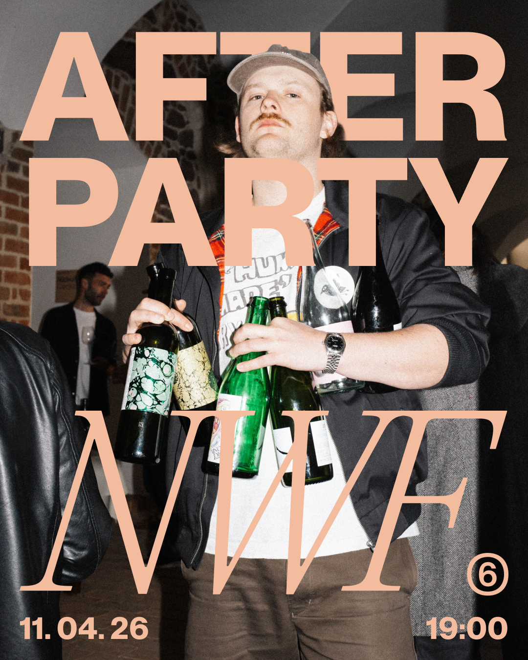
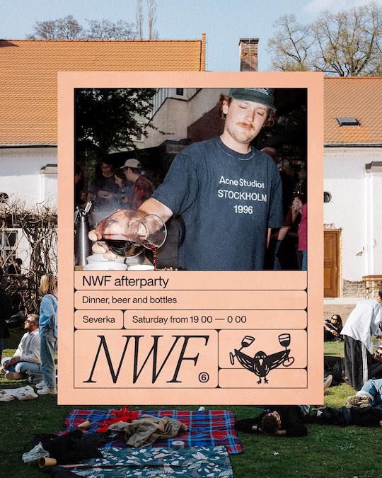
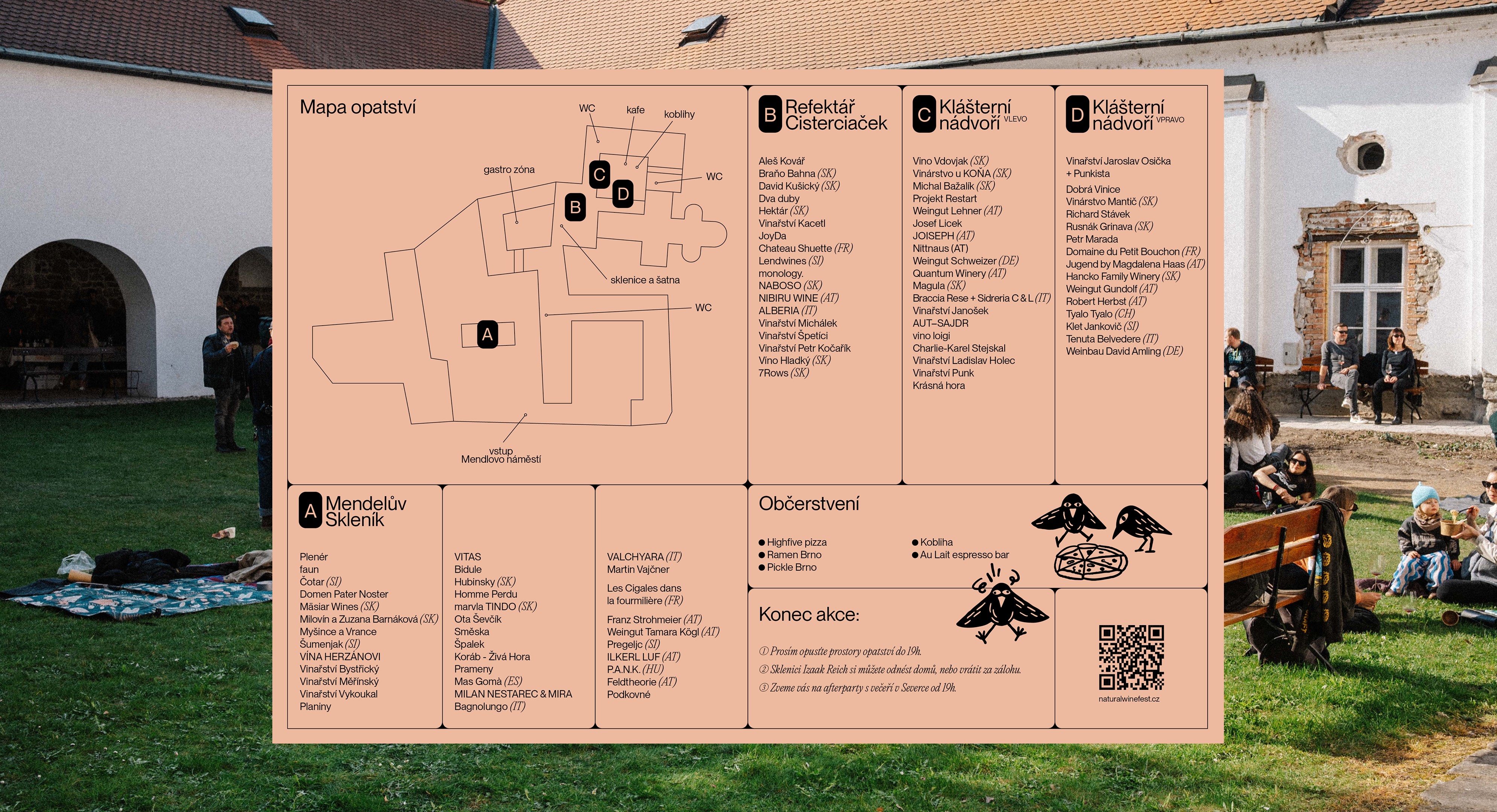
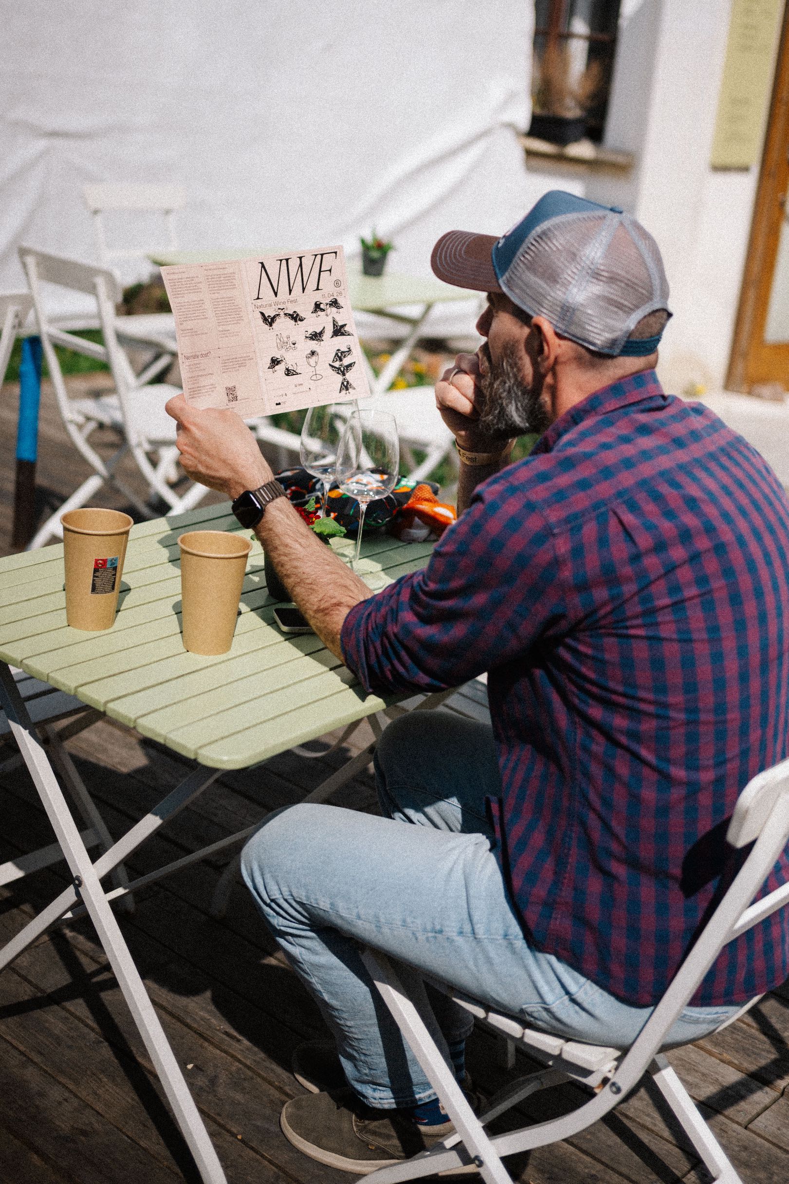
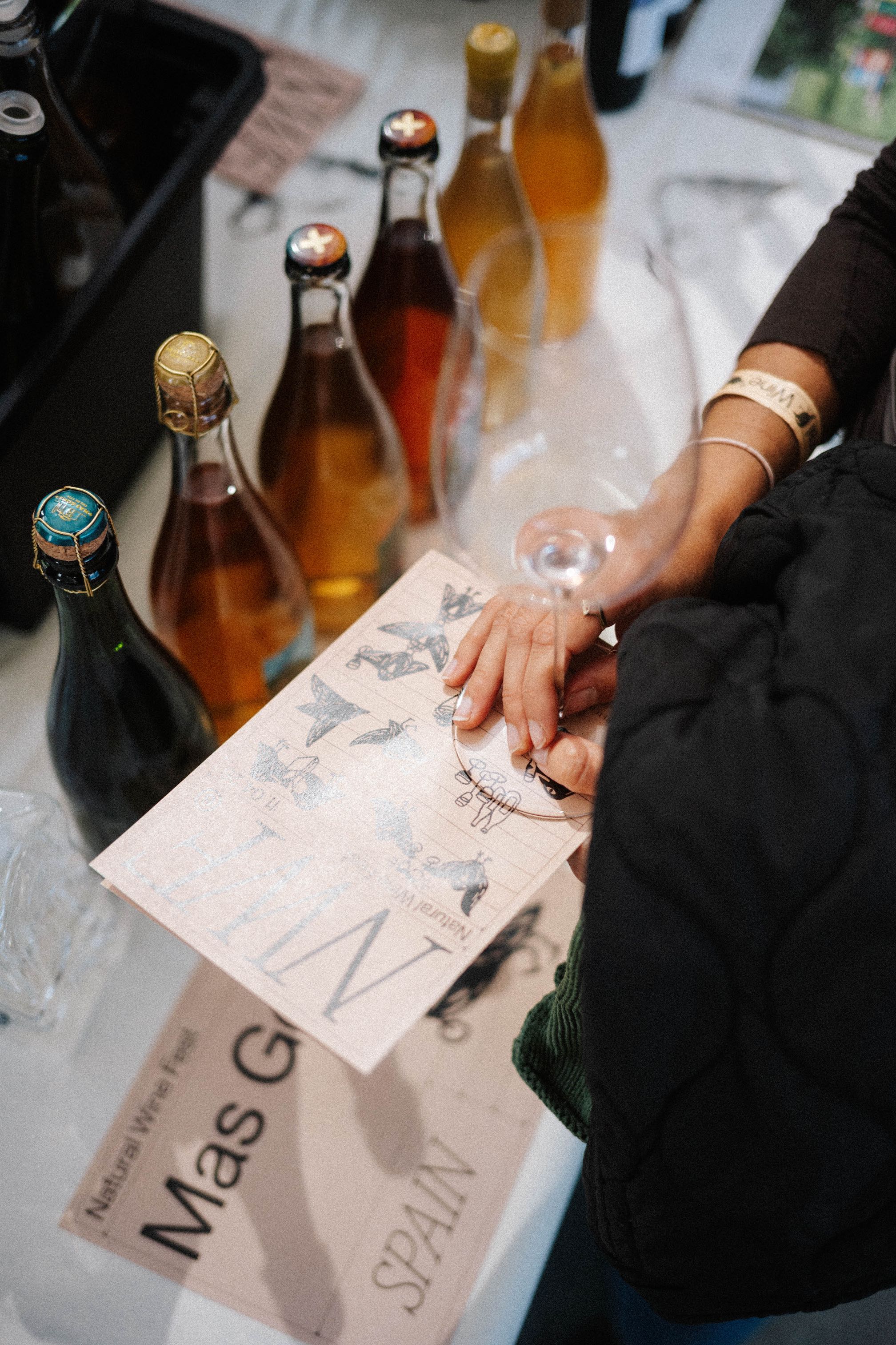
Natural Wine Shop and Fest landed well. The story feels authentic, and the brand looks like it belongs to the world of contemporary gastronomy. People clearly enjoy the new space, and the client is happy with how it turned out. The festival has now run under this identity for two years. Both years pulled in more visitors than the organisers expected. And the connection between the shop and the festival, one story told two ways, keeps getting clearer instead of fading.
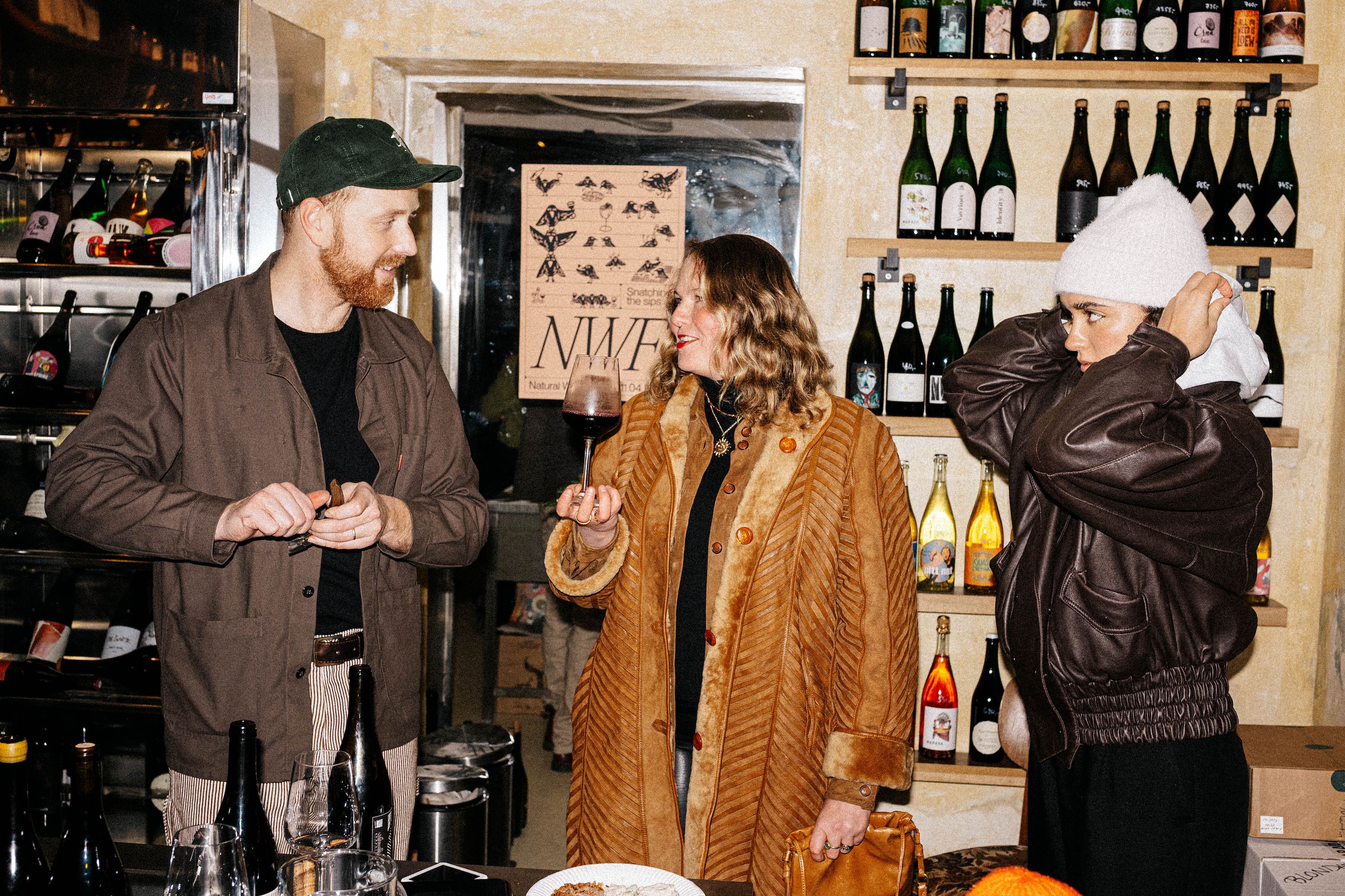
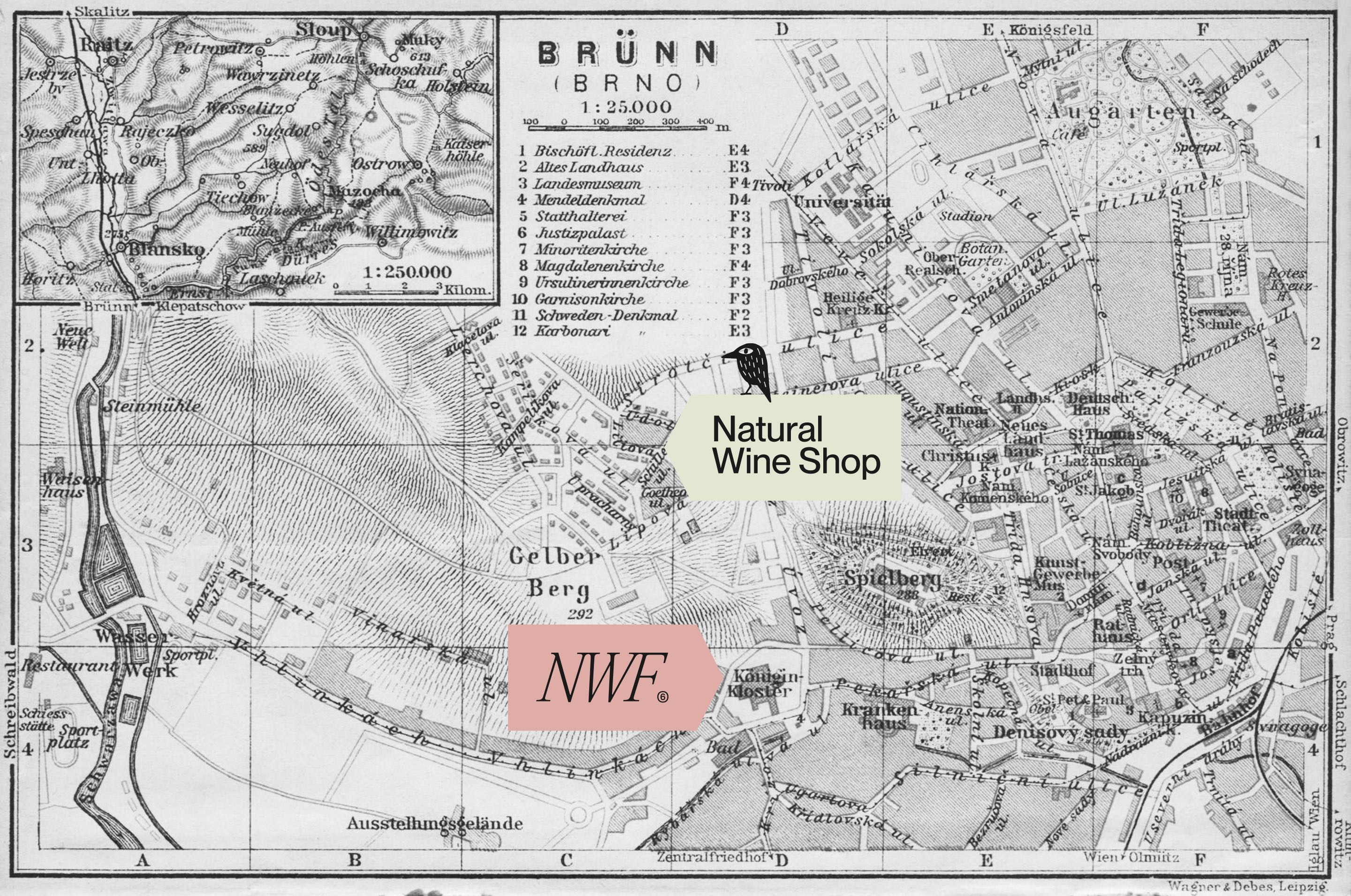
Natural Wine Shop is legendary Brno's natural wine shop. Natural Wine Fest is one of the biggest natural wine festivals in the region. Both are run by the same owners, built to solve the same problem: natural wine is a wild category, and people just want a good bottle they can trust.
The strategy is straightforward: care about wine, culture, and customers more than closing a sale. Build community instead of just selling to it. Respect the “punk” culture of natural wine growers. Care a lot, but never sell too hard.
The brand behaves like a starling. The bird every Moravian grower knows, not for eating indiscriminately but for going straight for the ripest grapes first. Natural Wine Shop and Natural Wine Fest work the same way: the owners taste before they buy, vineyard to vineyard, and only then bring the good ones back. One idea, two applications. The shop snatches the bottle, the festival snatches the grower.
The starling carries the system, but plays two roles. For the shop it's a fixed mark, repeated exactly for instant recognition. For the festival it's a looser illustration, multiplying and shifting like people mingling at the event. Specific content can swap in a related icon. Glassware, a pizza, a bottle. Typography pairs a tall condensed serif with an italic accent; colour sits on black ink and a rotating earth-tone palette.
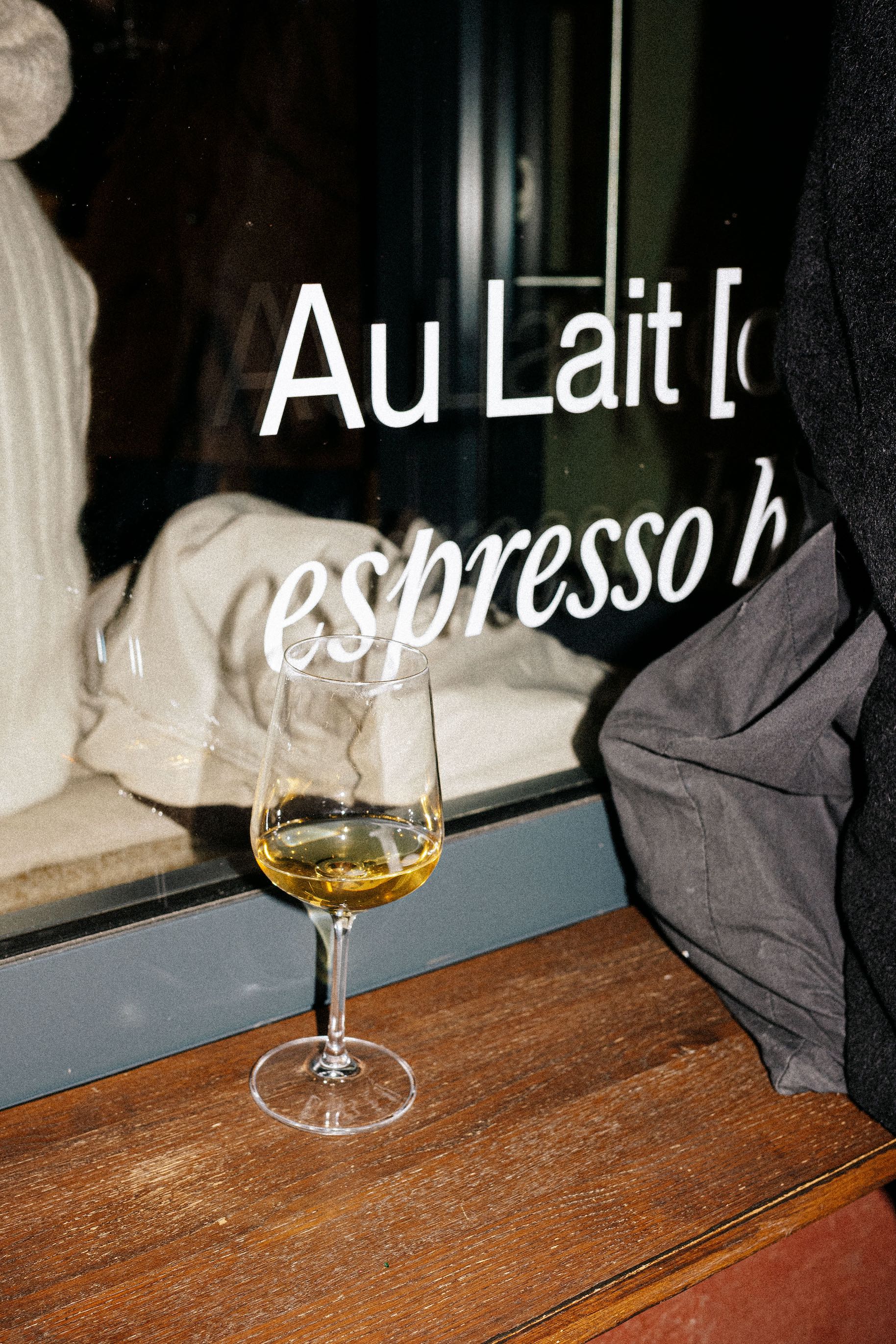
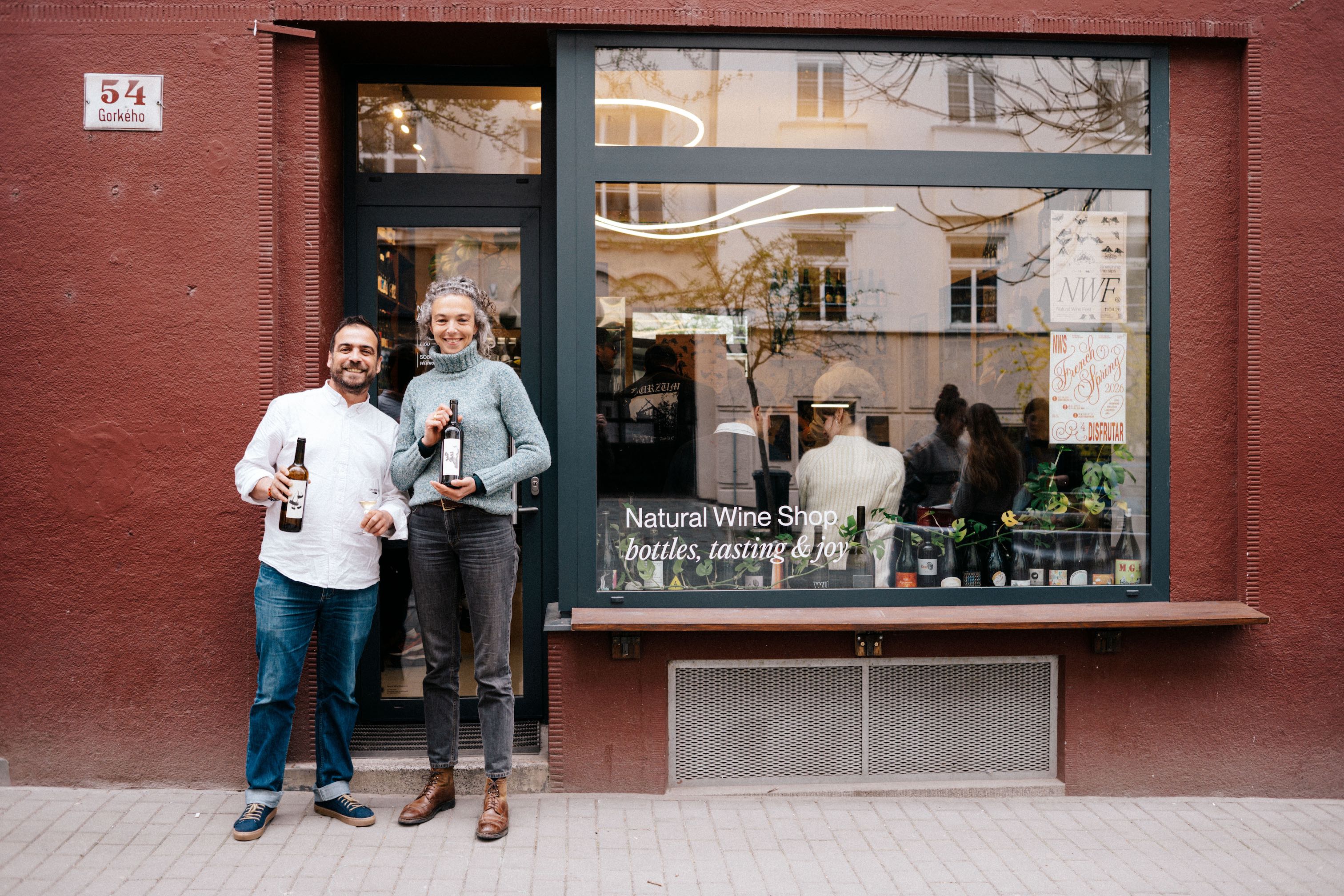
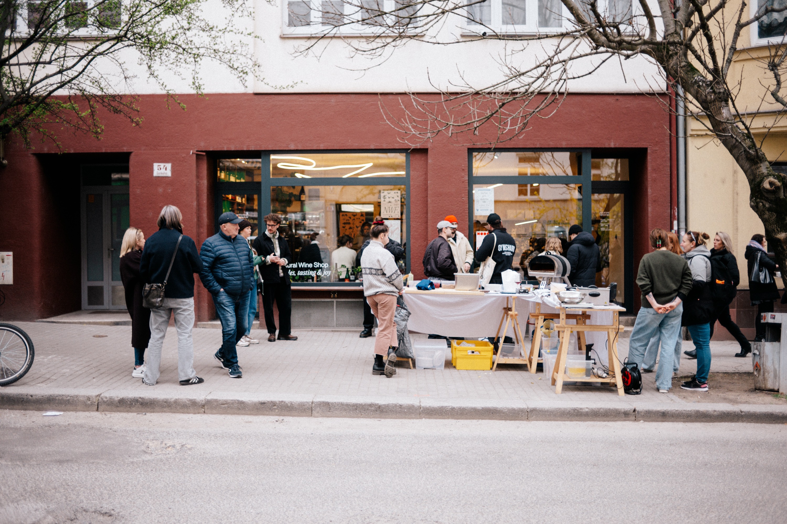
Natural Wine Shop got full on-site branding, designed around its move to new premises. Natural Wine Fest got a complete event package: signage, wayfinding, producer plaques, social conten. Every touchpoint carrying the bird back to the same system.
Natural Wine Shop and Fest landed well. The brand feels authentic, and people clearly enjoy the new space. The festival has now run under this identity for two years, both pulling in more visitors than expected and the connection between shop and festival keeps getting clearer.
STRATEGY: L-AB
DESIGN: L-AB
WEBDESIGN: L-AB
ILLUSTRATION: BÁRA RŮŽIČKOVÁ
PHOTOGRAPHY: VOJTĚCH FILKO