

Runestone. Real-time data and fan engagement infrastructure, built for esports from the inside. The brand challenge was to make an invisible infrastructure product impossible to overlook, and to position Runestone as the partner publishers trust with their data.
ValkaAI. Unfolding the brand.
- Challenge
Infrastructure that works best when nobody notices it vs. a brand that has to be noticed. Every match produces millions of data points per second, and almost none of it reaches the people who could use it. Most tools serving esports were borrowed from traditional sports, and the rest lean on betting to make data pay. Runestone needed a brand that made its value visible.
- Strategy
The most decisive moments in a match are often the ones nobody sees. The economy shift three rounds before the round that decides the game. The rotation that wins the map. The anomaly in a player's stats that signals something is wrong. Runestone's value is surfacing exactly these moments: not more data, the right data, in real time, for the right audience. That became the brand essence: Light up esports. One line that describes both what the product does and what the brand stands for.
- Idea
Runestones carried meaning through inscription. In Nordic myth, the significant ones glowed: light is what turned an ordinary stone into a message. Runestone does the same with match data. It takes what sits beneath the surface and makes it shine for broadcasters, fans, and publishers. The Nordic thread isn't borrowed. It comes from the same heritage that shaped Realms Group, the holding company Runestone belongs to.
- Logo
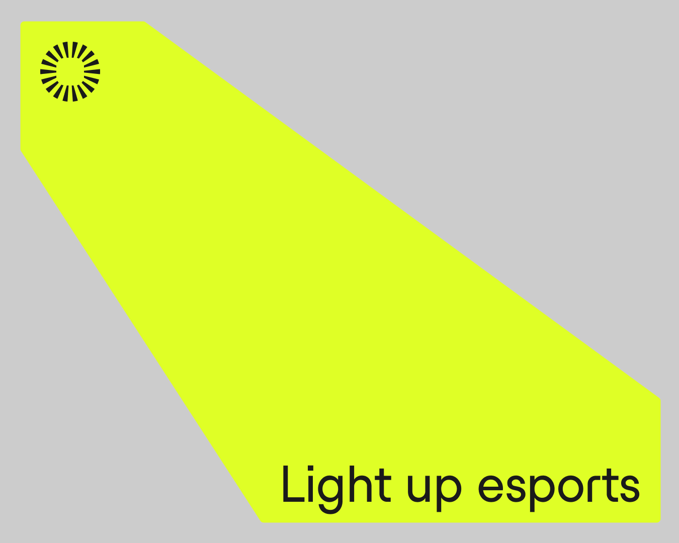
The Radiant Stone. A circle of radiating segments with a rounded square in the negative space: a stone that doesn't just hold information, it broadcasts it. The logotype is set in Studio Feixen Edgy, with letterforms that follow the logic of rune script redrawn for screens rather than carved in stone.
- Color
Runestone is black and white by default. Yellow is the light. It is reserved for the beam and for highlighting key information, never for decoration. Because it is rare, it works: the eye goes where the light goes, the same way a viewer's attention follows the data Runestone surfaces.
- Typography
Runestone speaks in Studio Feixen Edgy, a Swiss typeface whose angular letterforms echo rune carving, redrawn for screens. Its stylistic sets shift the voice from sharp to calm. We locked four of them to hit one exact balance: enough edge to feel like esports, enough clarity to read live data at a glance. Configured this way, the font becomes Runestone's own voice.

- Identity
A square grid carries the system, invisible but load-bearing, like the infrastructure itself. Four stylistic sets lock the typeface into one consistent voice across every designer and surface. Photography is shot from the inside: close to players and gear, in real arena light, with room left for the beam. The rule behind every decision is simple. If it doesn't illuminate, it doesn't belong.
- Application
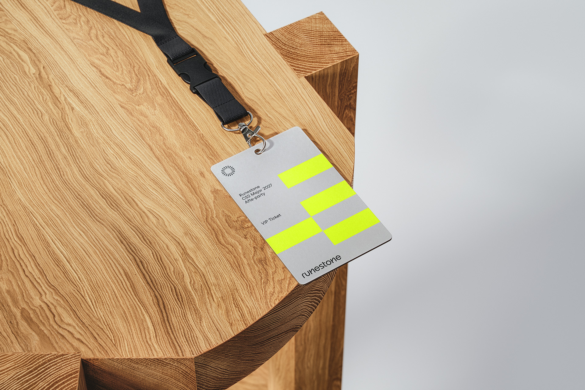
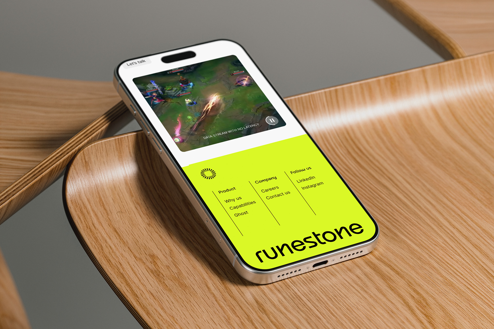
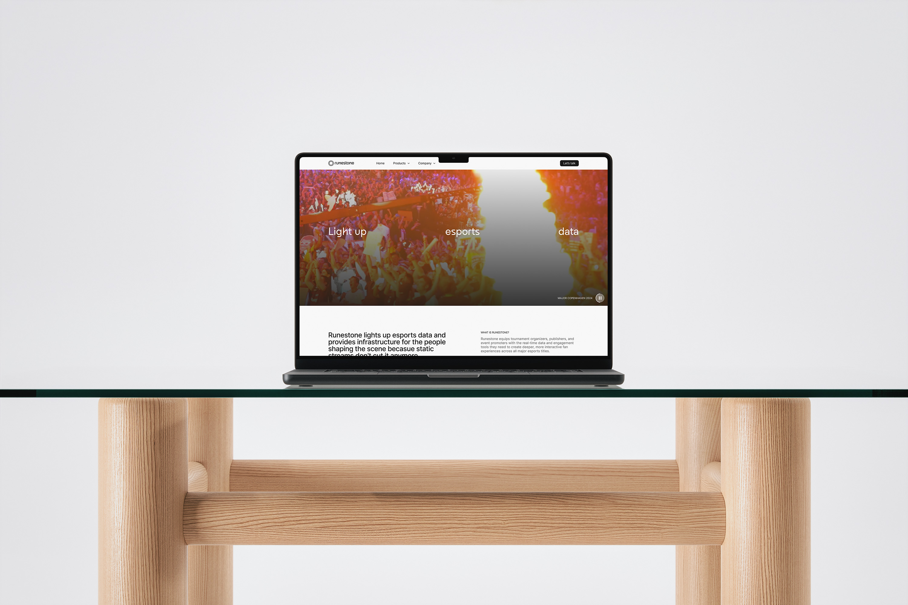
The beam moves across event displays, LinkedIn insight and product posts, stationery, badges, and event apparel. On data posts, the yellow highlight lands on the single stat that matters, turning a feed of numbers into a clear point.
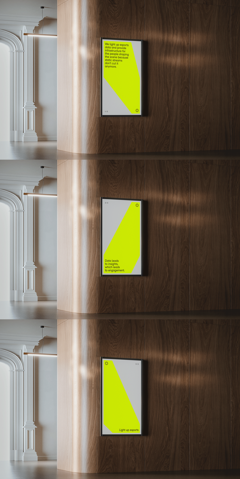
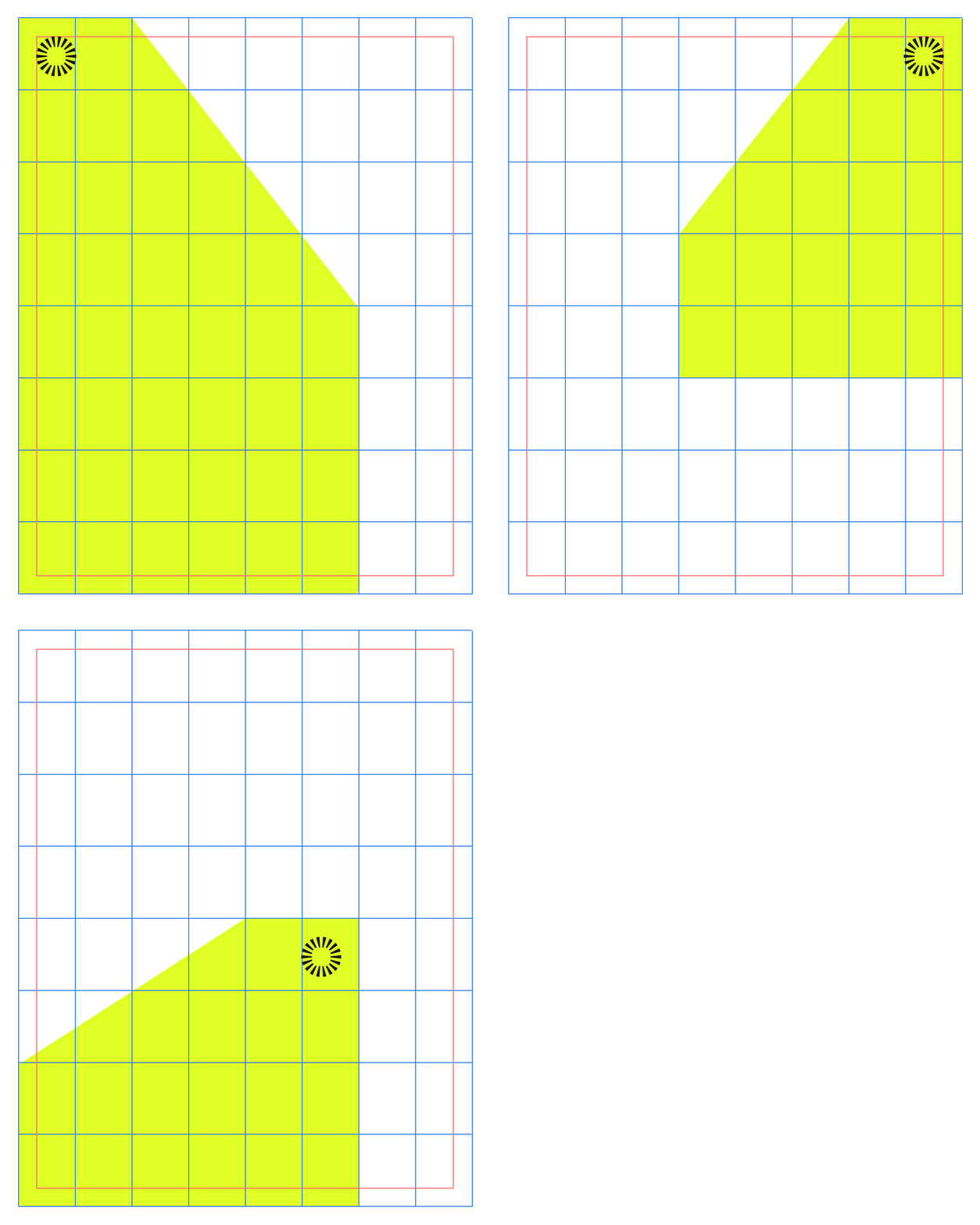
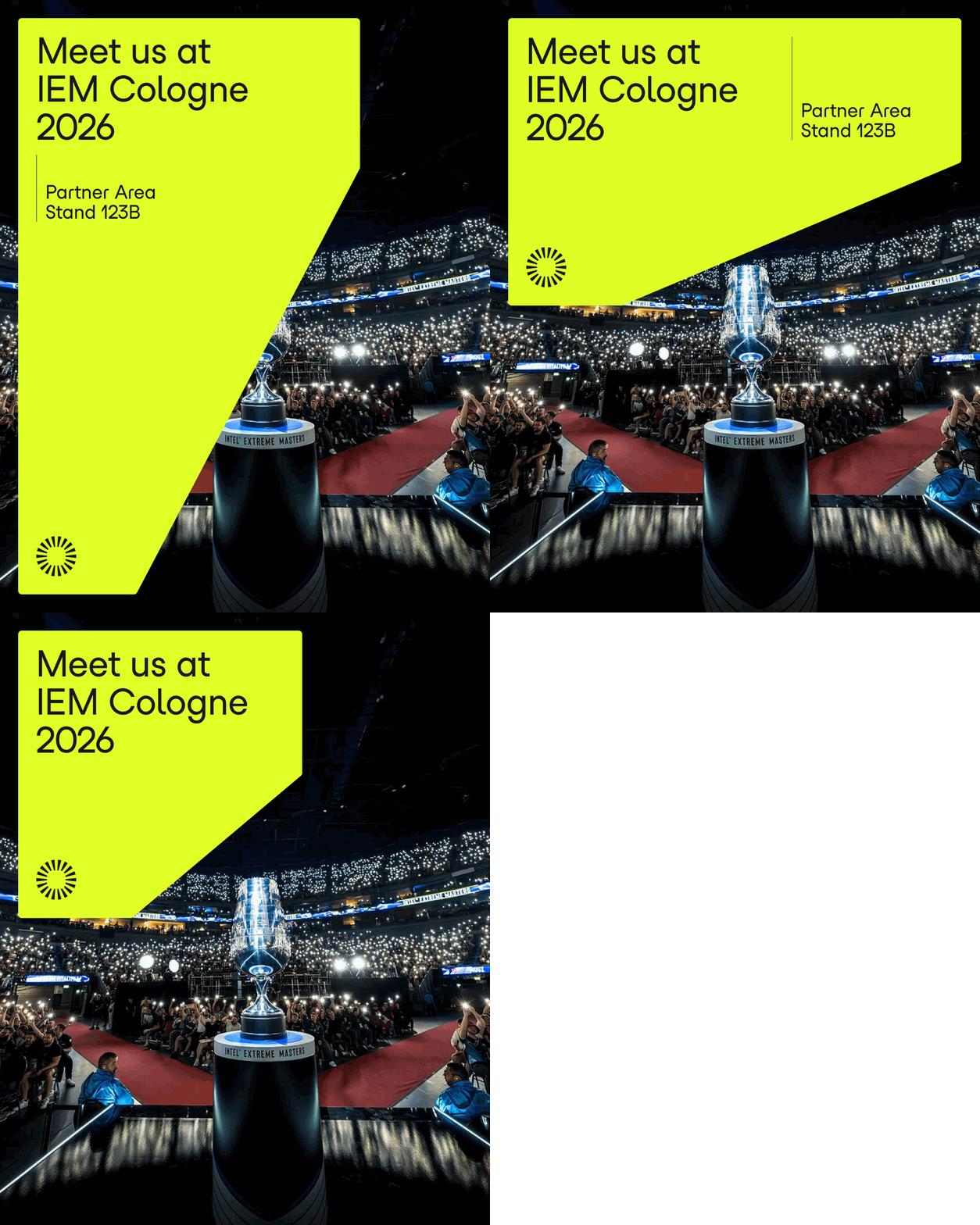
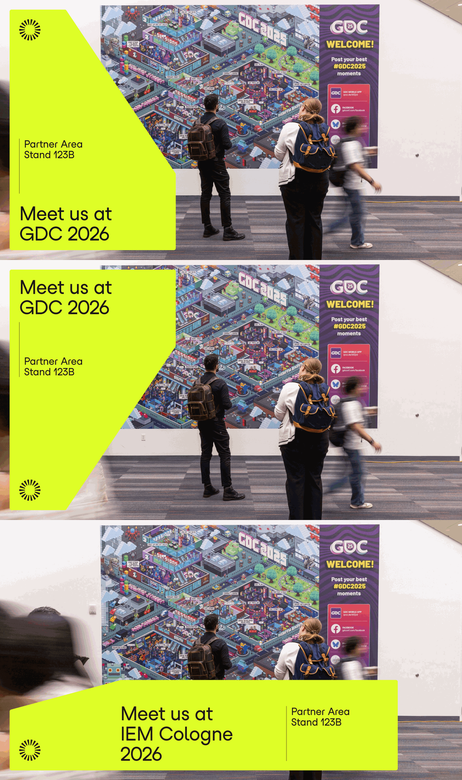
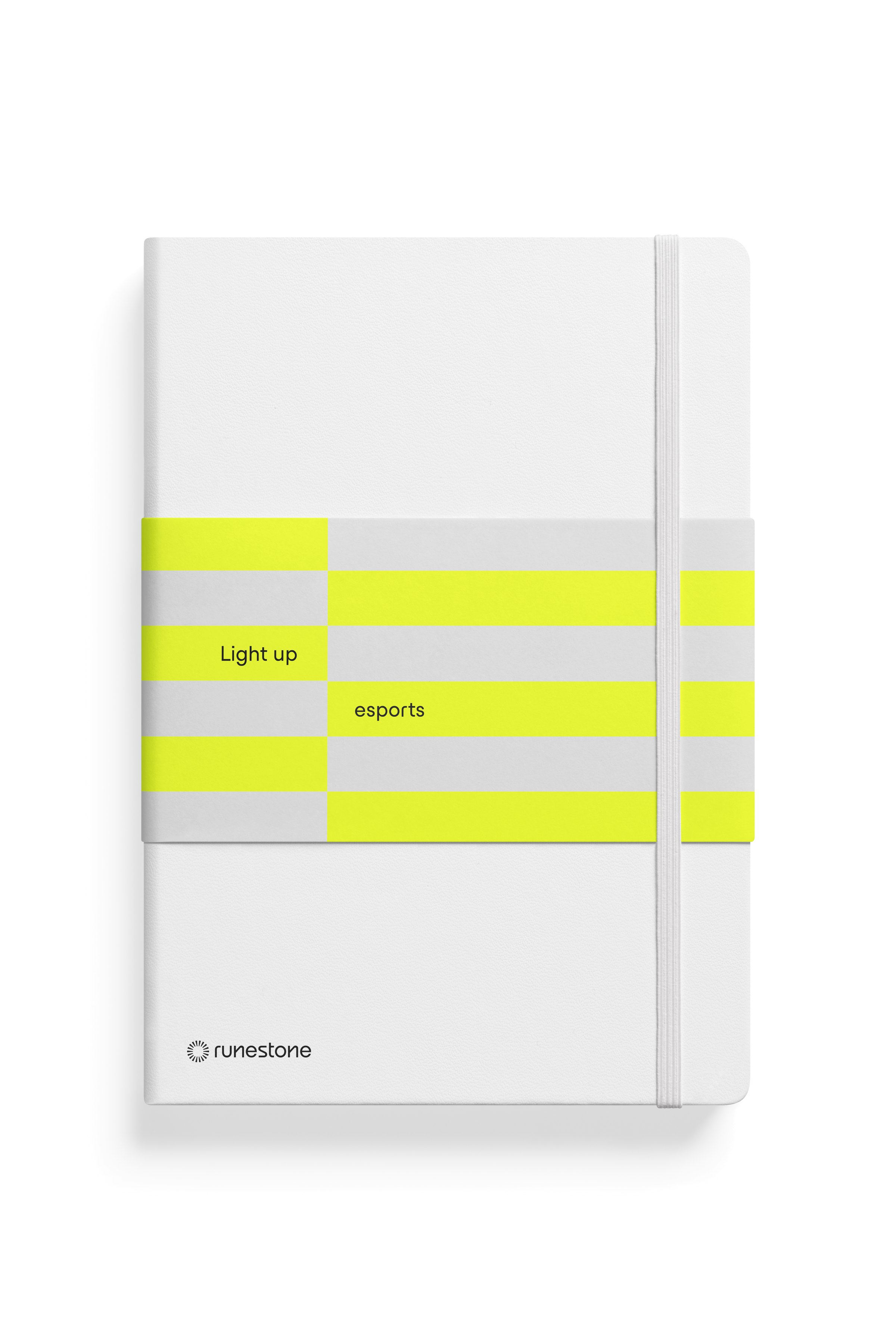
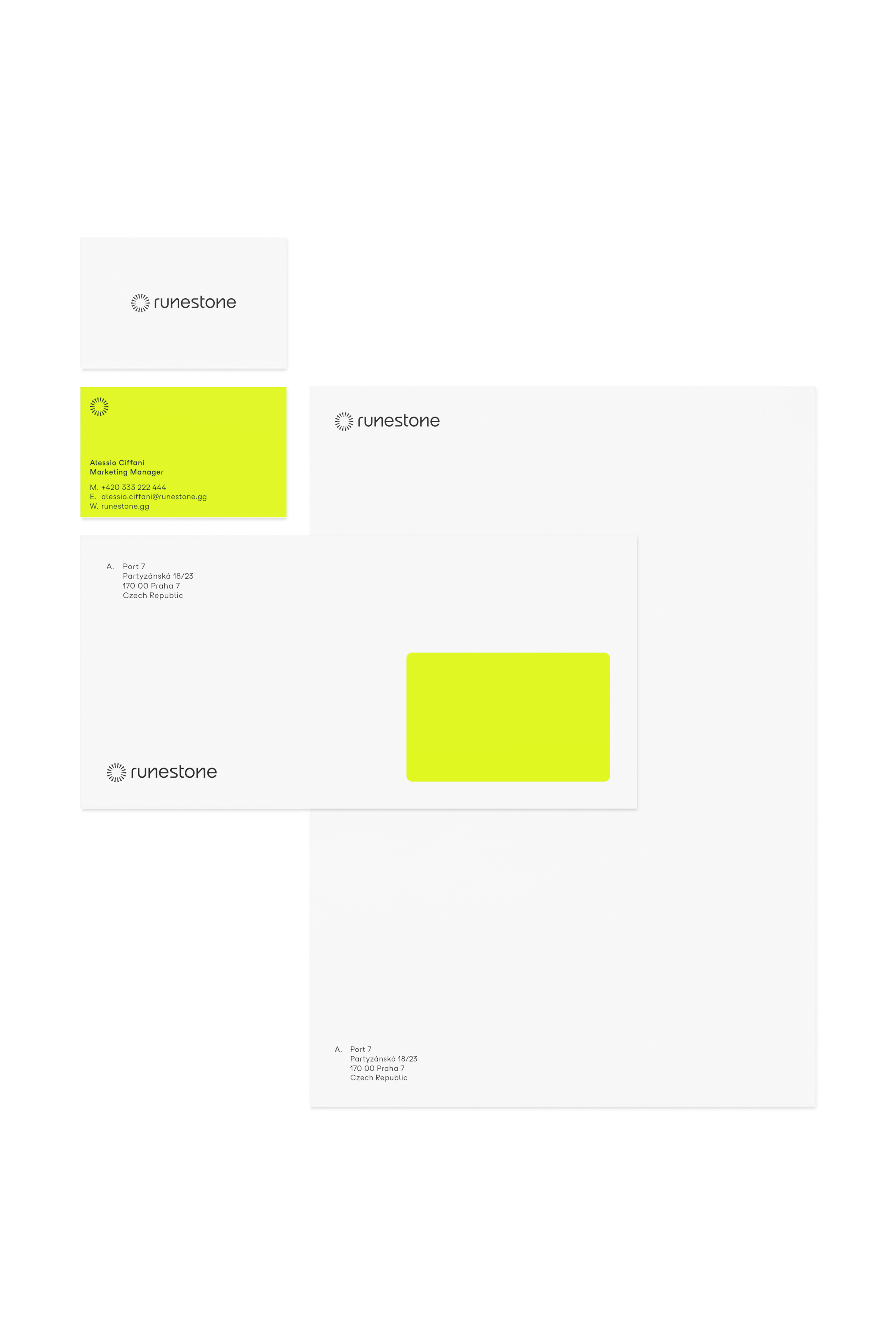
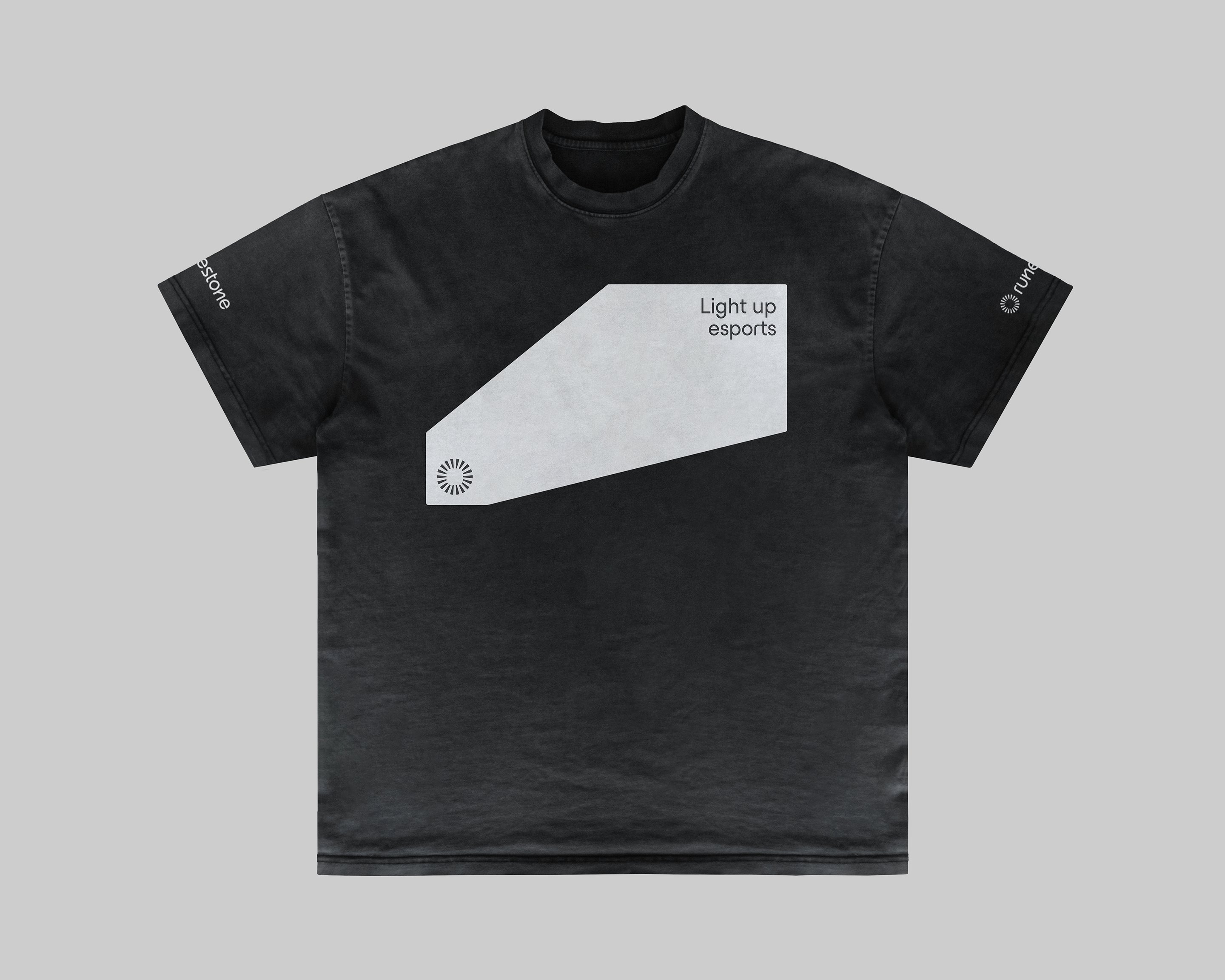
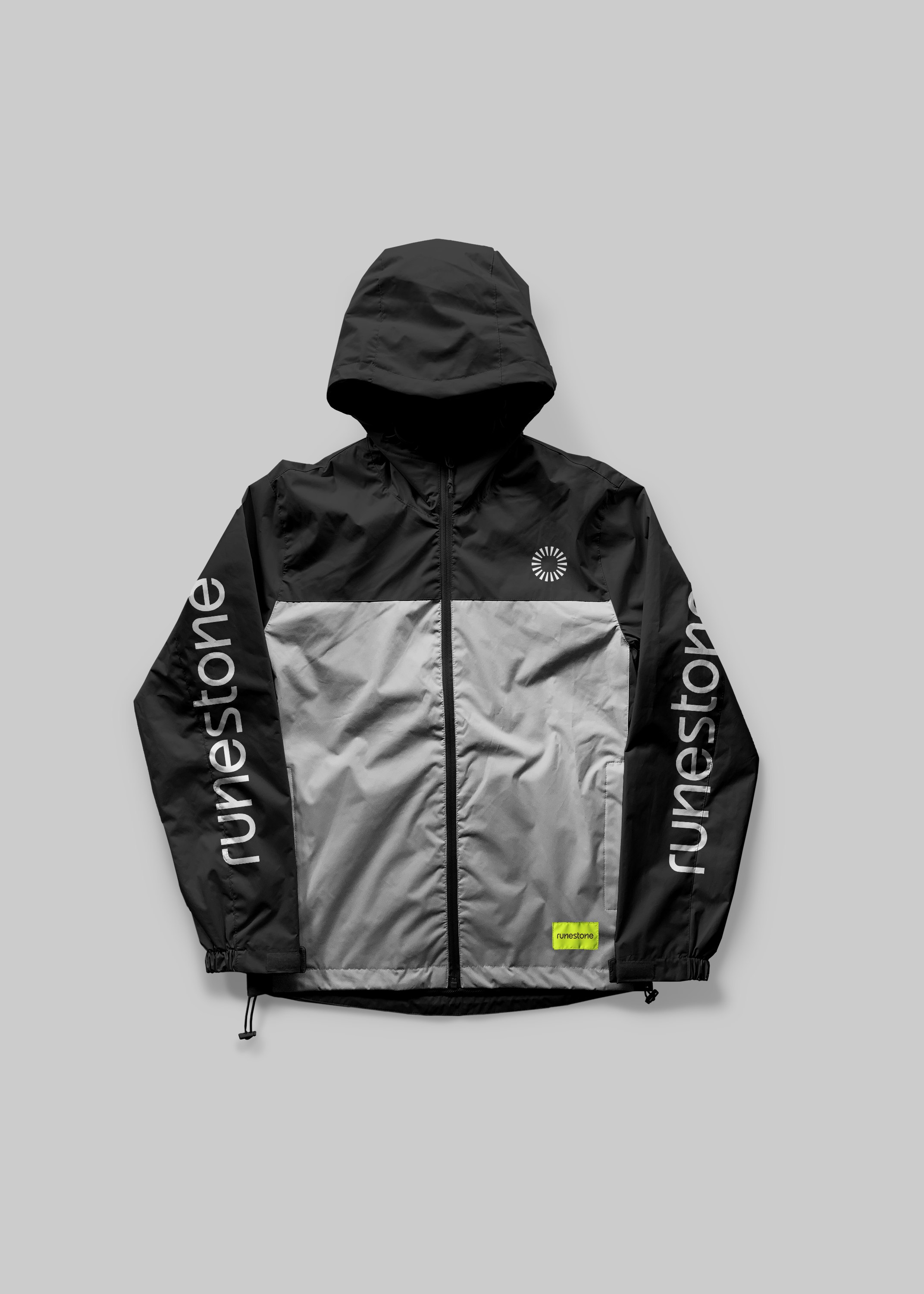
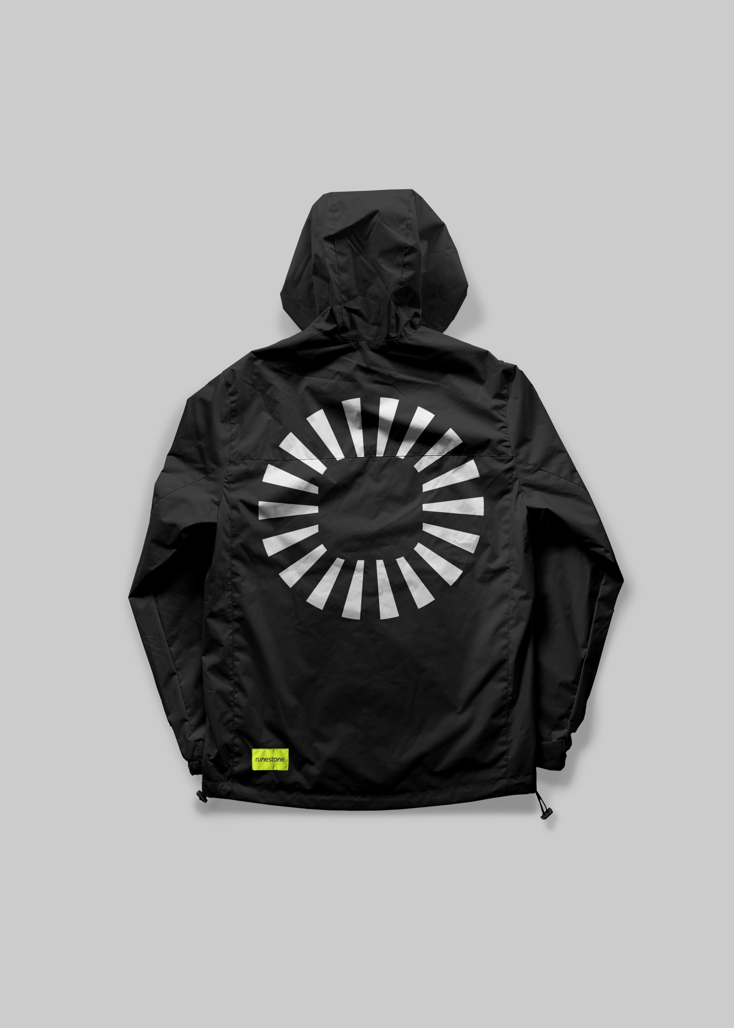
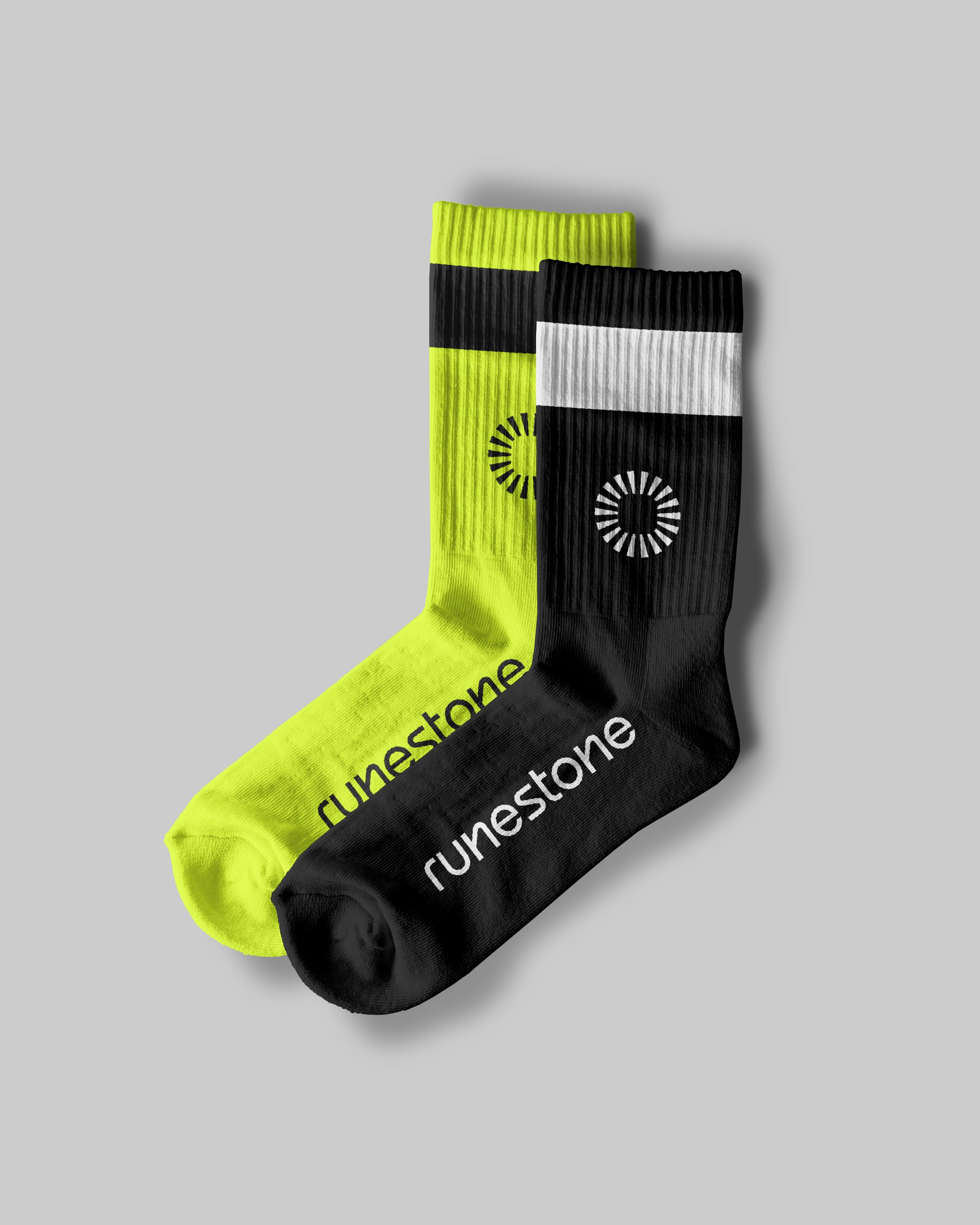
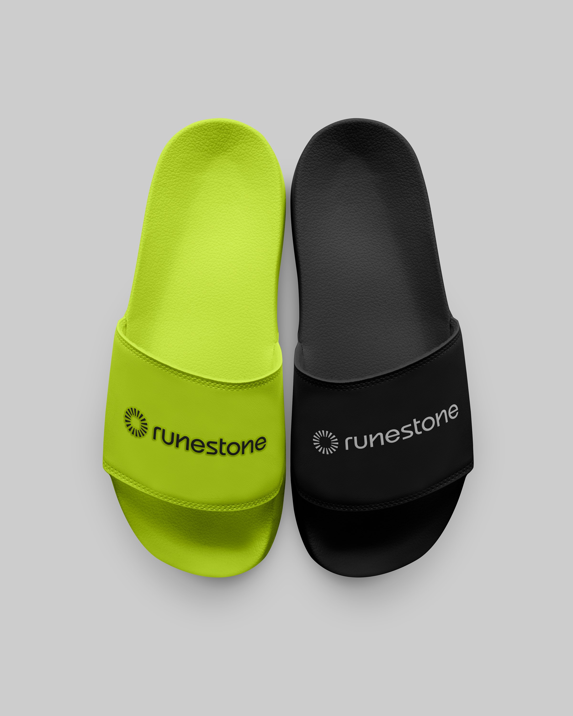
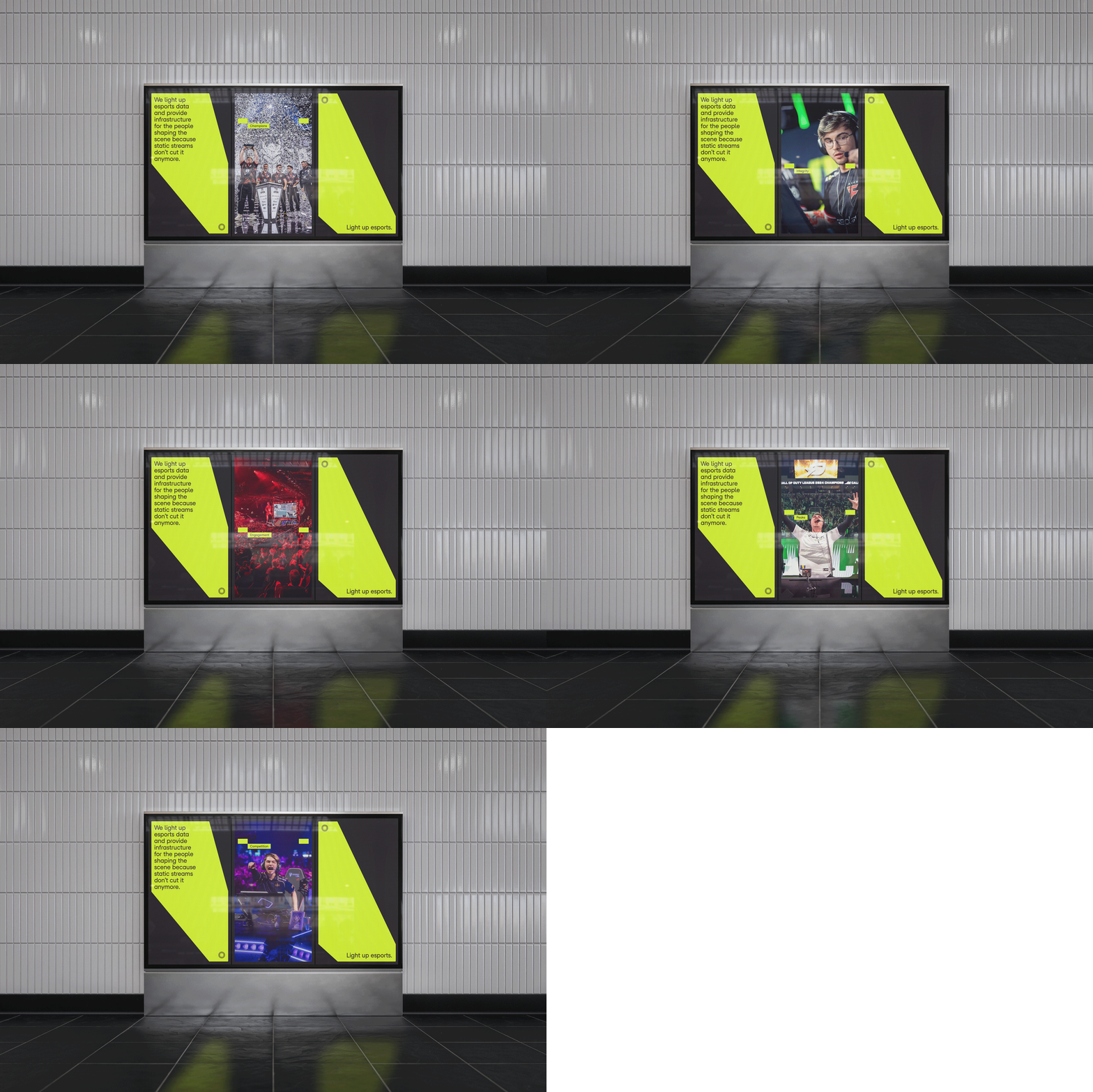
As Runestone adds titles and products, the system scales with it. Every new product, insight, or event gets the same treatment: one beam, pointed at what matters.
Competitive gaming is one of the most complex live products ever built. Every match generates millions of data points per second, audiences spread across dozens of platforms, and communities that punish bad actors fast. Yet most infrastructure serving esports was borrowed from traditional sports or leans on betting to make data pay.
Runestone was built from inside the industry. As the data and fan engagement arm of Realms Group, it delivers real-time match data and products like Ghost and a Twitch Extension that turn passive viewers into active participants. The brand challenge: make infrastructure that works best unnoticed into a brand that is impossible to overlook.
The answer came from the product itself. The most decisive moments in a match are often invisible: the economy shift before the round that decides the game, the rotation that wins the map, the anomaly that signals something is wrong. Runestone surfaces them. That became the brand essence: Light up esports.
The idea draws on Nordic runestones, which carried meaning through inscription. In myth, the significant ones glowed. The Radiant Stone translates this into a circle of radiating segments around a rounded square: a stone that broadcasts. The Nordic thread comes from the same heritage that shaped Realms Group.
From the mark, the idea runs through the whole system. The beam, a directed light, originates from the logo and lands on grid intersections, cutting between signal and noise. Runestone is black and white by default, and yellow is the light: reserved for the beam and key information, so the eye always goes where the light goes. A square grid, a precisely configured typeface, and photography shot from inside the arena keep everything structured and credible.
Across event displays, social content, stationery, and apparel, every application does what the product does: points at the one thing worth seeing. As Runestone grows, the system grows with it.
STRATEGY: L-AB
DESIGN: L-AB
WEBDESIGN: L-AB