
ValkaAI. A startup on a mission to build a new category: AI-native entertainment. Our task was to establish ValkaAI brand as a serious infrastructure player while building character assets that drive recognition.
ValkaAI. Unfolding the brand.
- Challenge
The brand challenge was to establish ValkaAI as a serious infrastructure player while building character assets that drive recognition. The company needed to signal scale and credibility from day one, then layer in the distinctive personality that makes ValkaAI memorable in a crowded AI landscape.
- Strategy
The brand idea builds on a fundamental human truth: we feel before we think. Facial expressions register emotionally in milliseconds, long before rational processing begins. This is why ValkaAI's brand leads with the AI personas themselves.
- Brand Name
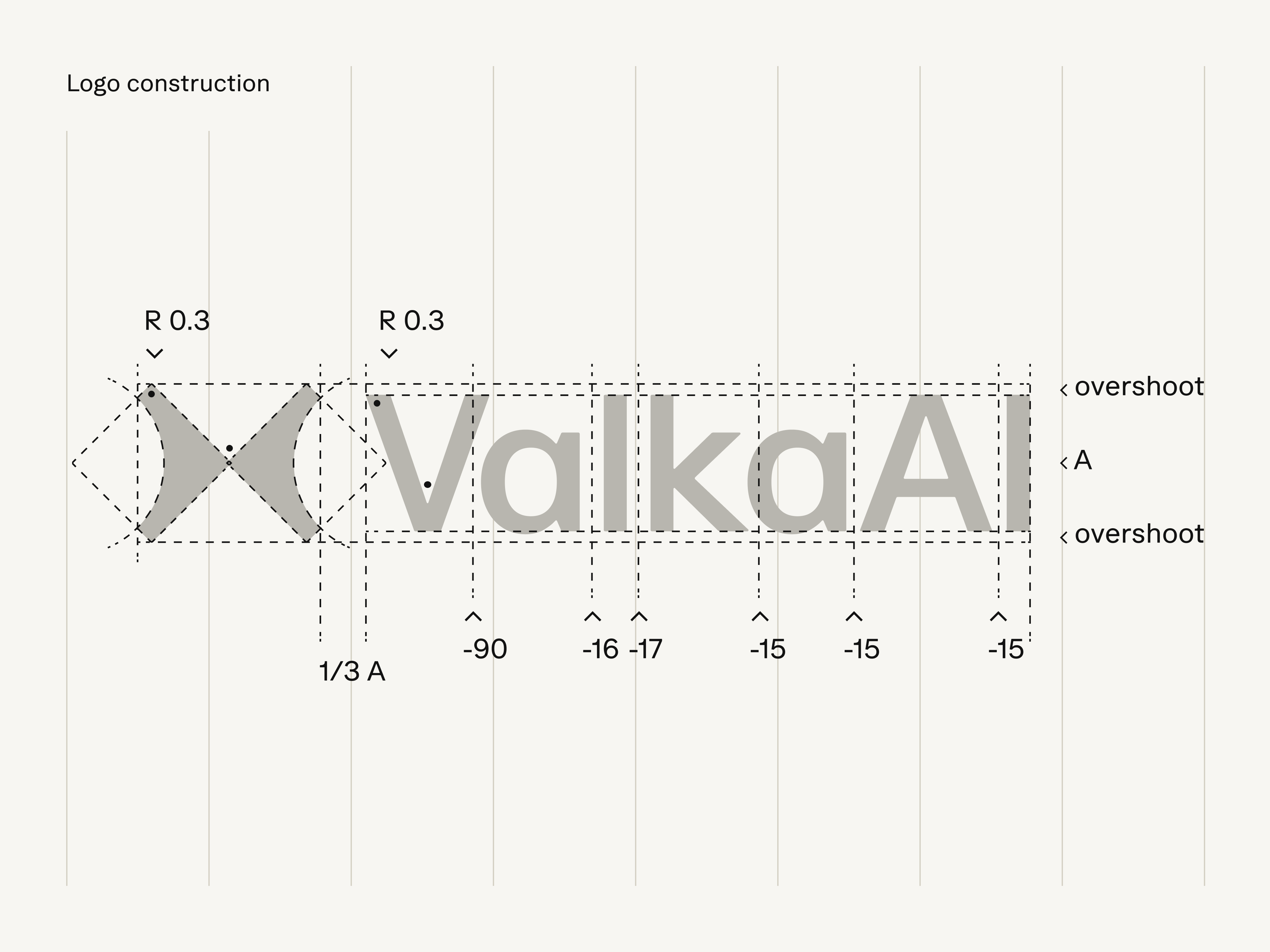
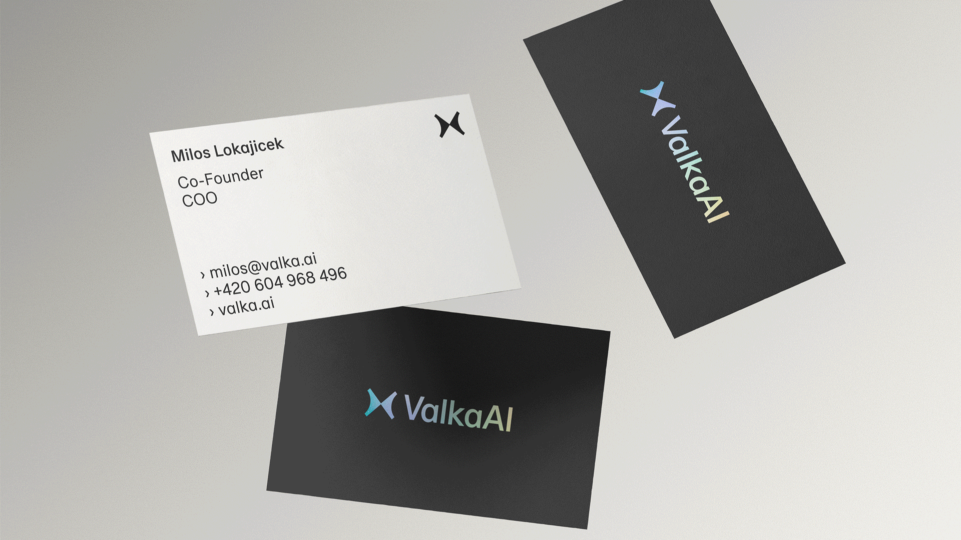
The founders chose ValkaAI, derived from Valkyrie—the Norse figures who guide souls between worlds. This mythology of crossing boundaries informed the logo design: a mirrored butterfly symbolizing the bridge between real and digital realities.
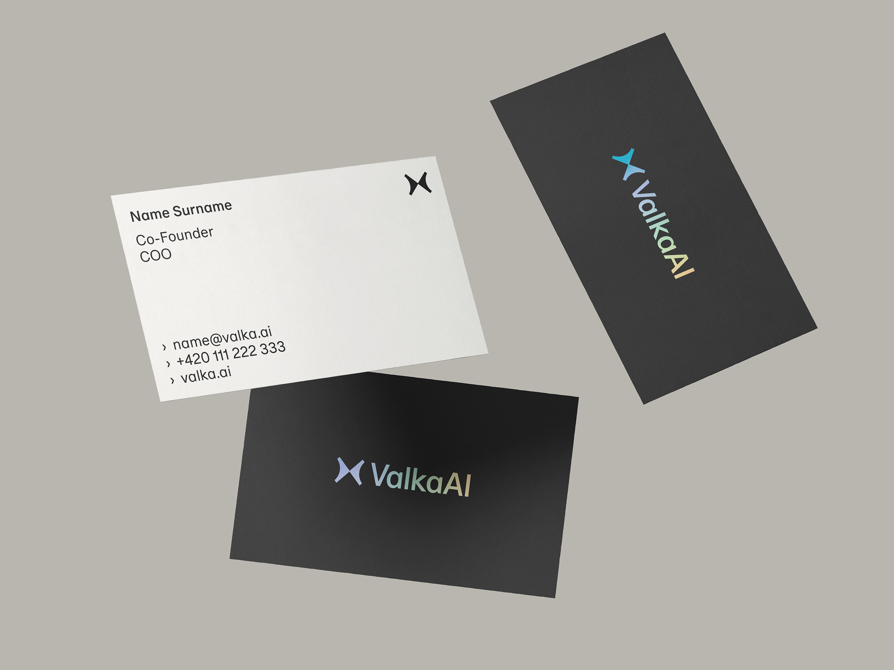
- Logo
The logo design is a geometric butterfly symbolizing transformation and emotion. It is a metaphor that is felt first, understood later, mirroring how ValkaAI's personas connect with their audiences.
- Identity
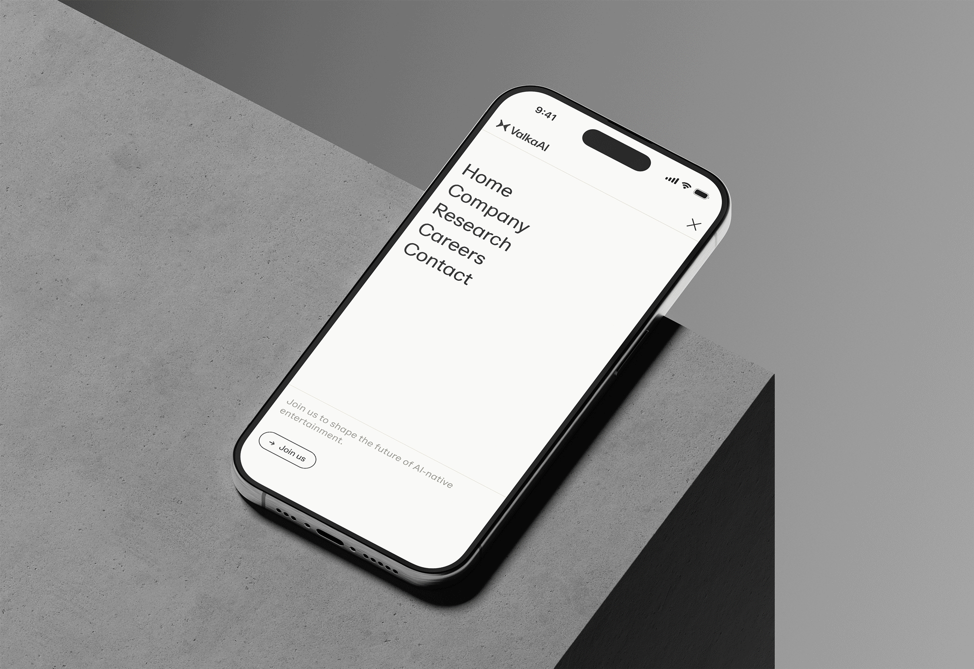
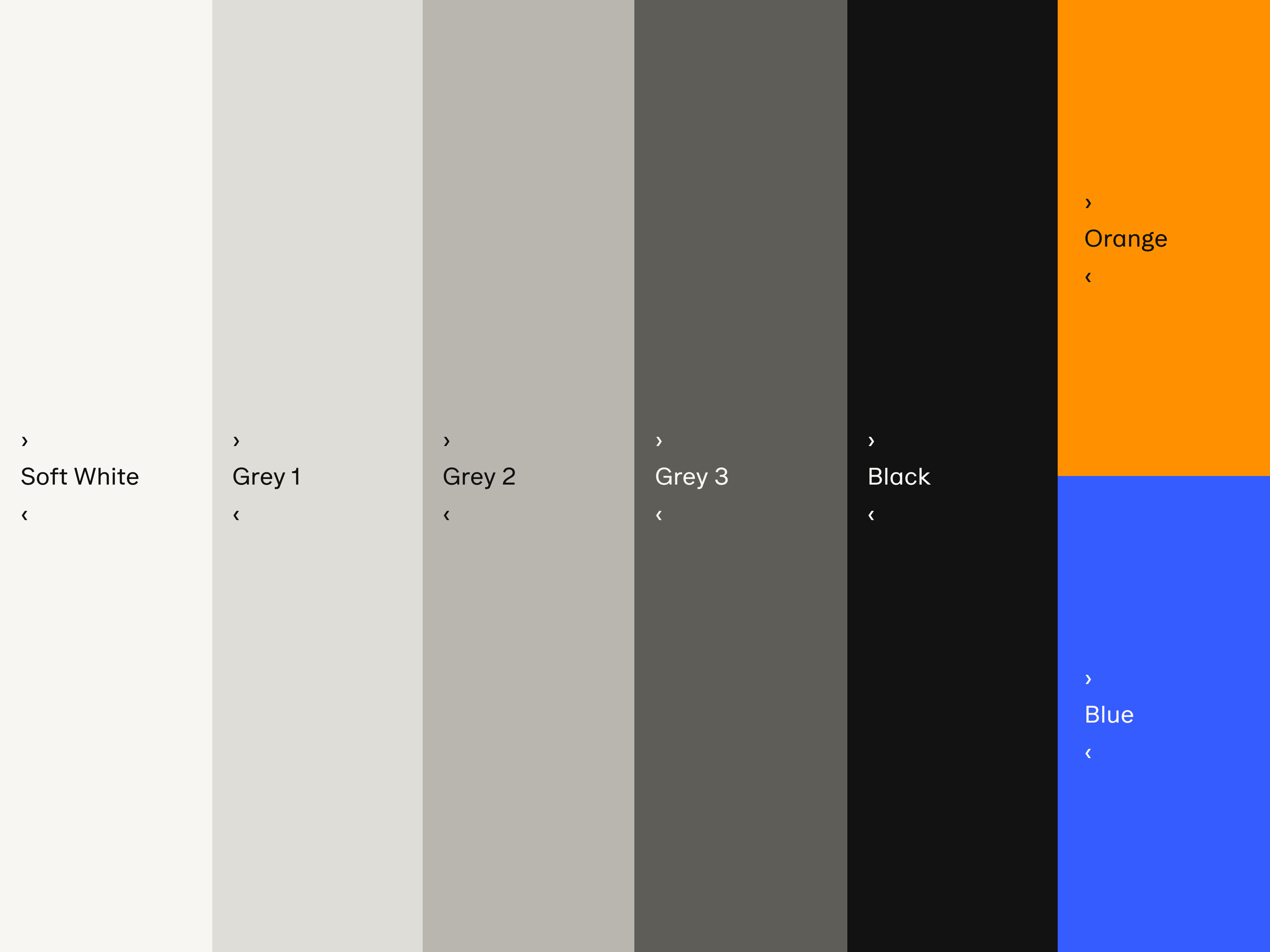
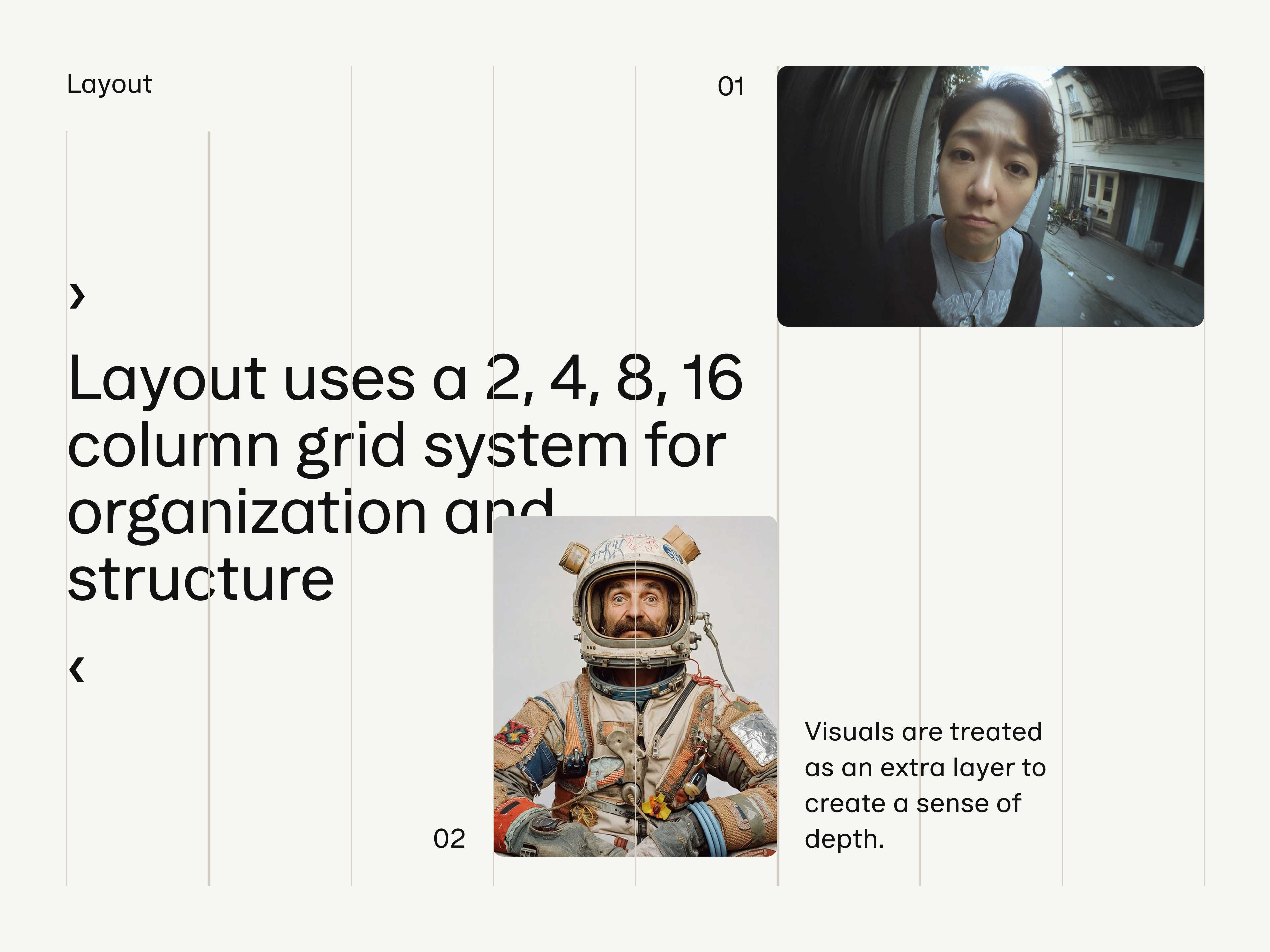
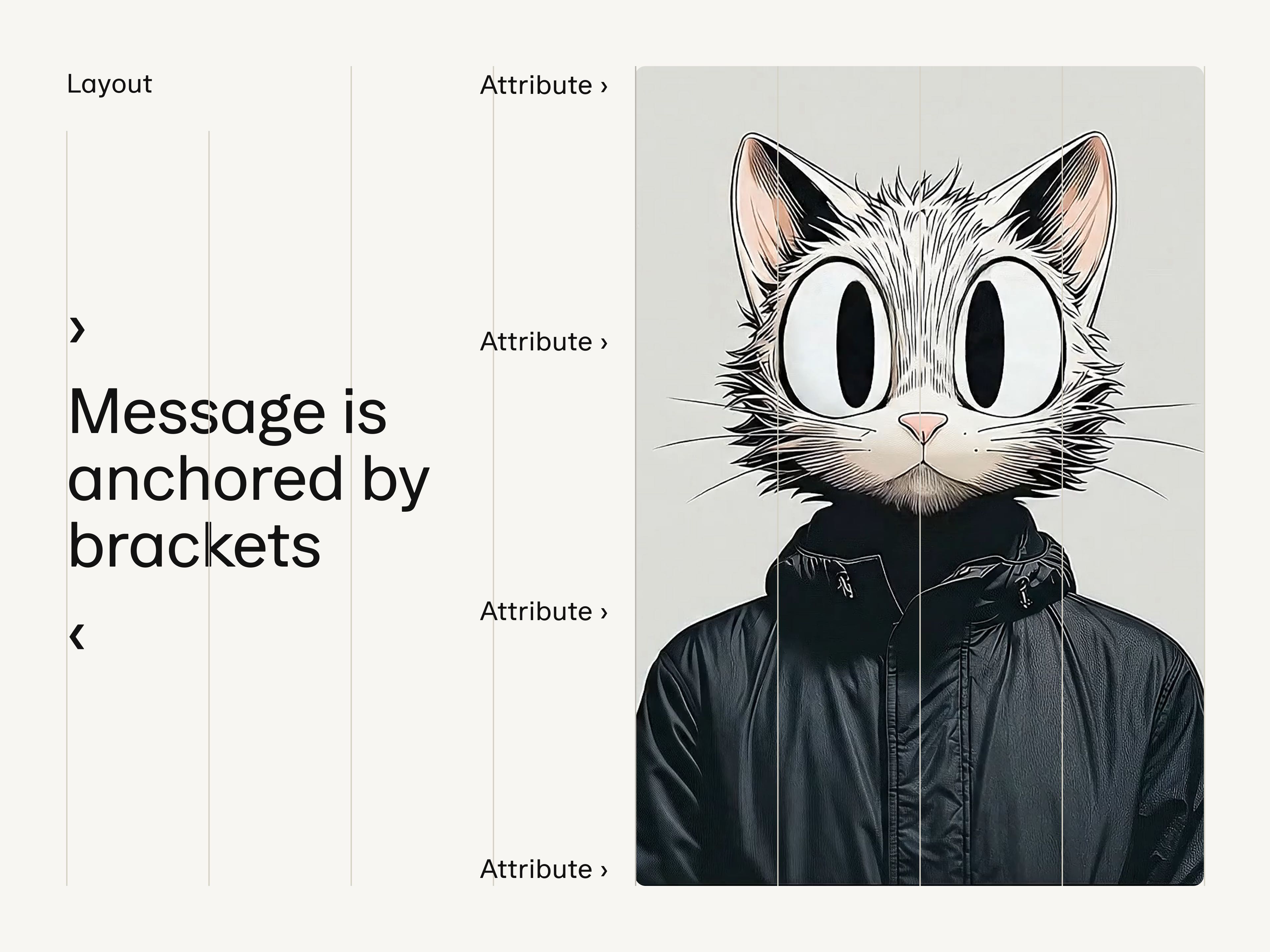
The visual identity treats AI personas as the primary brand asset. Typography and layouts work as a secondary layer, structuring information and providing context without competing for attention. A foundation of warm whites and grays keeps personas luminous, with blue and orange reserved as navigational accents.
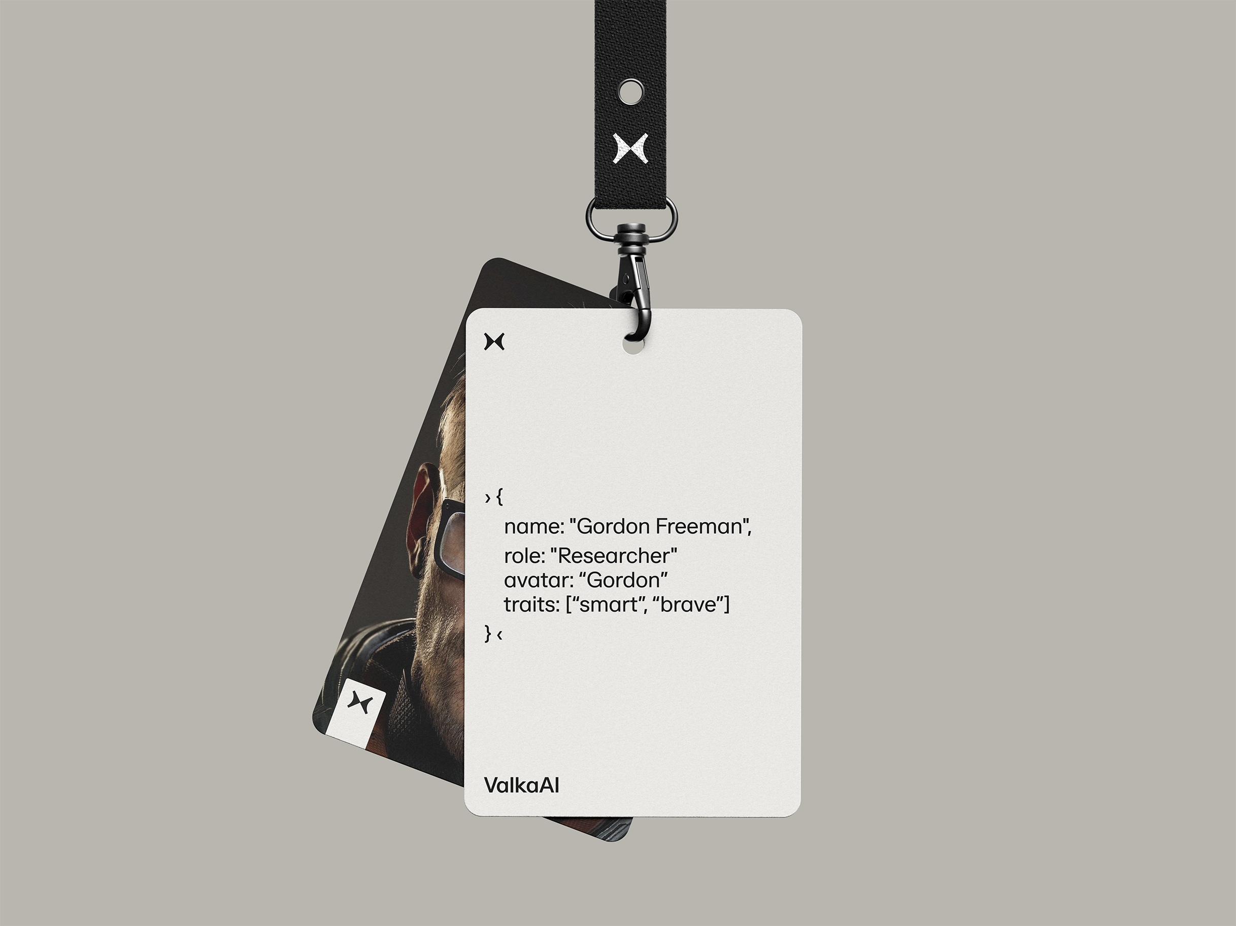
- Photography
Internally, ValkaAI draws inspiration from Pixar's early years: clear focus on craft, no-nonsense execution. The internal brand reflects this through analog photography and unpolished documentation that feels immediate and authentic.
- Motion
Wherever possible, the brand communicates through motion: light, welcoming animations that reinforce the ease of implementation and the fluid nature of AI personas coming to life.


As ValkaAI scales to platform infrastructure, the brand grows with it. The emotion-led positioning remains constant, distinctive enough to own mental space, flexible enough to accommodate new personas and use cases.
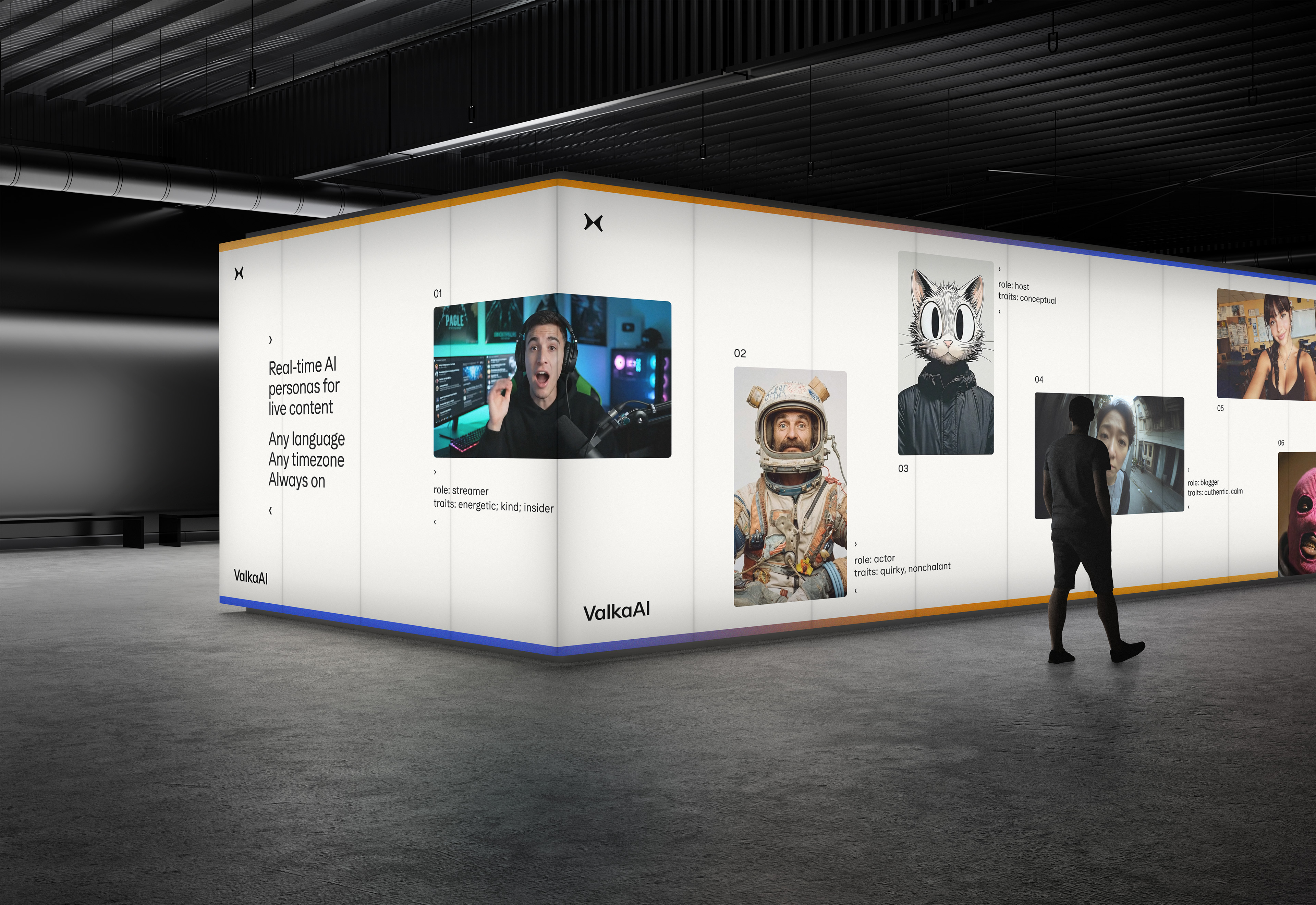
Digital entertainment platforms operate 24/7 across dozens of languages, far beyond what human talent can cover. One esports caster can't cover 10 languages, content creators can't stream around the clock, live events need hosts who never tire. ValkaAI built the solution: a digital entertainment studio that delivers real-time AI personas.
The brand challenge was to establish ValkaAI as a serious infrastructure player while building character assets that drive recognition. The company needed to signal scale and credibility from day one, then layer in the distinctive personality that makes ValkaAI memorable in a crowded AI landscape.
The founders chose ValkaAI, derived from Valkyrie—the Norse figures who guide souls between worlds. This mythology of crossing boundaries informed the logo design: a mirrored butterfly symbolizing the bridge between real and digital realities.
The brand idea builds on a fundamental human truth: we feel before we think. Facial expressions register emotionally in milliseconds, long before rational processing begins. This is why ValkaAI's brand leads with the personas themselves, AI faces that communicate emotion instantly. The butterfly reinforces this principle—transformation felt first, understood later, mirroring how ValkaAI's personas connect with their audiences.
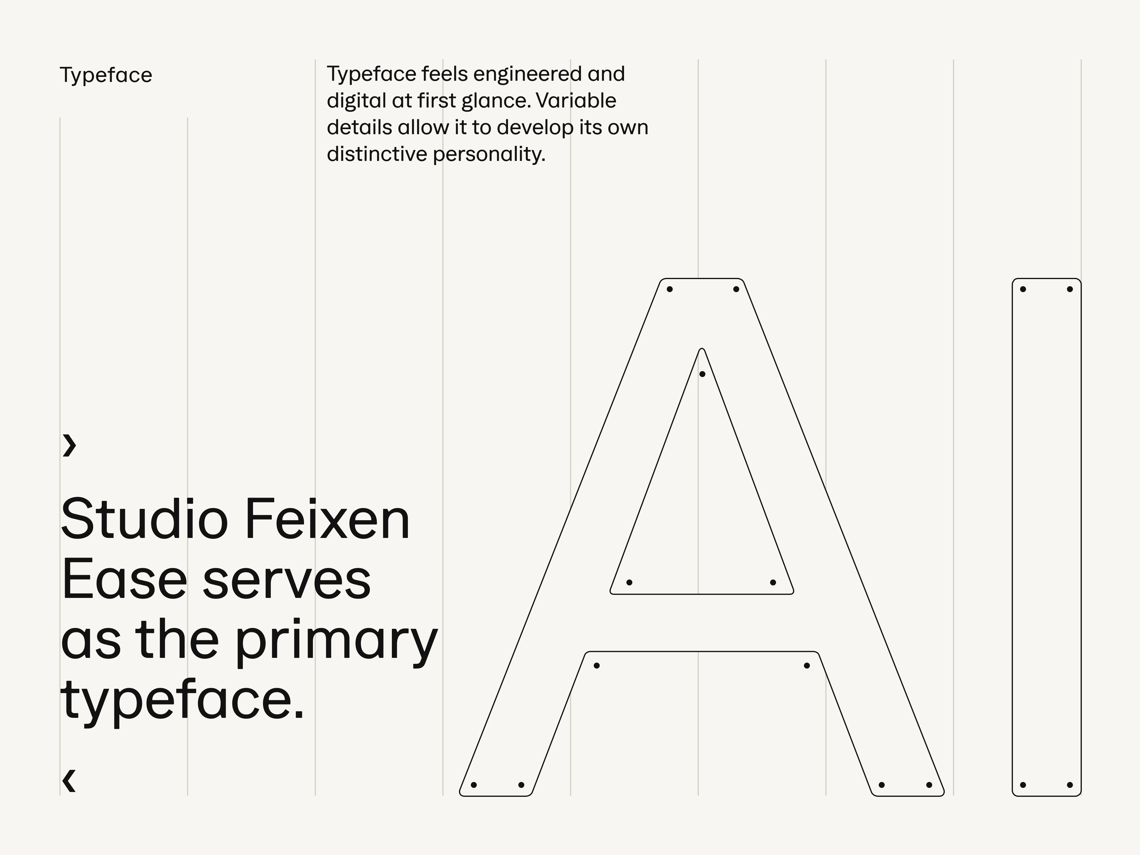
The visual identity treats AI personas as the primary brand asset. Typography and layouts work as a secondary layer, structuring information and providing context without competing for attention. The typeface blends algorithmic precision with organic curves. A foundation of warm whites and grays keeps personas luminous, with blue and orange reserved as navigational accents. Wherever possible, the brand communicates through motion—light animations that reinforce ease of implementation.
Internally, ValkaAI draws inspiration from Pixar's early years: clear focus on craft, no-nonsense execution, small teams achieving outsized impact. The internal brand reflects this through analog photography and unpolished documentation that feels immediate and authentic—a deliberate counterpoint to the polished AI personas the company produces.
As ValkaAI scales to platform infrastructure, the brand grows with it. The emotion-led positioning remains constant, distinctive enough to own mental space in a crowded AI landscape, flexible enough to accommodate new personas and use cases.
Brand strategy: in-house
Brand design: in-house
Photography: in-house
Brand standards: in-house
Webdesign: in-house
3D logo animation: Kryštof ježek